The Beginning of A Great Project!
Project Scope
Our world around us is full of people who create everyday. These creators can be artists, designers, musicians, photographers, etc. Most of our world wouldn’t be what it was without many of these people and sometimes it’s good to feel represented. Most creators also thrive off caffeine, which can be a sense of motivation for most.
Elixor Energy Drink is a company that is geared towards creators who want a little boost to get their creative juices flowing. Sometimes we need a little help to get started on our day or even to jumpstart a project that we’re working to finish. Elixor will allow creators to feel completed and connected to their line of creativity and succeed.
Deliverables
One (1) Logo design
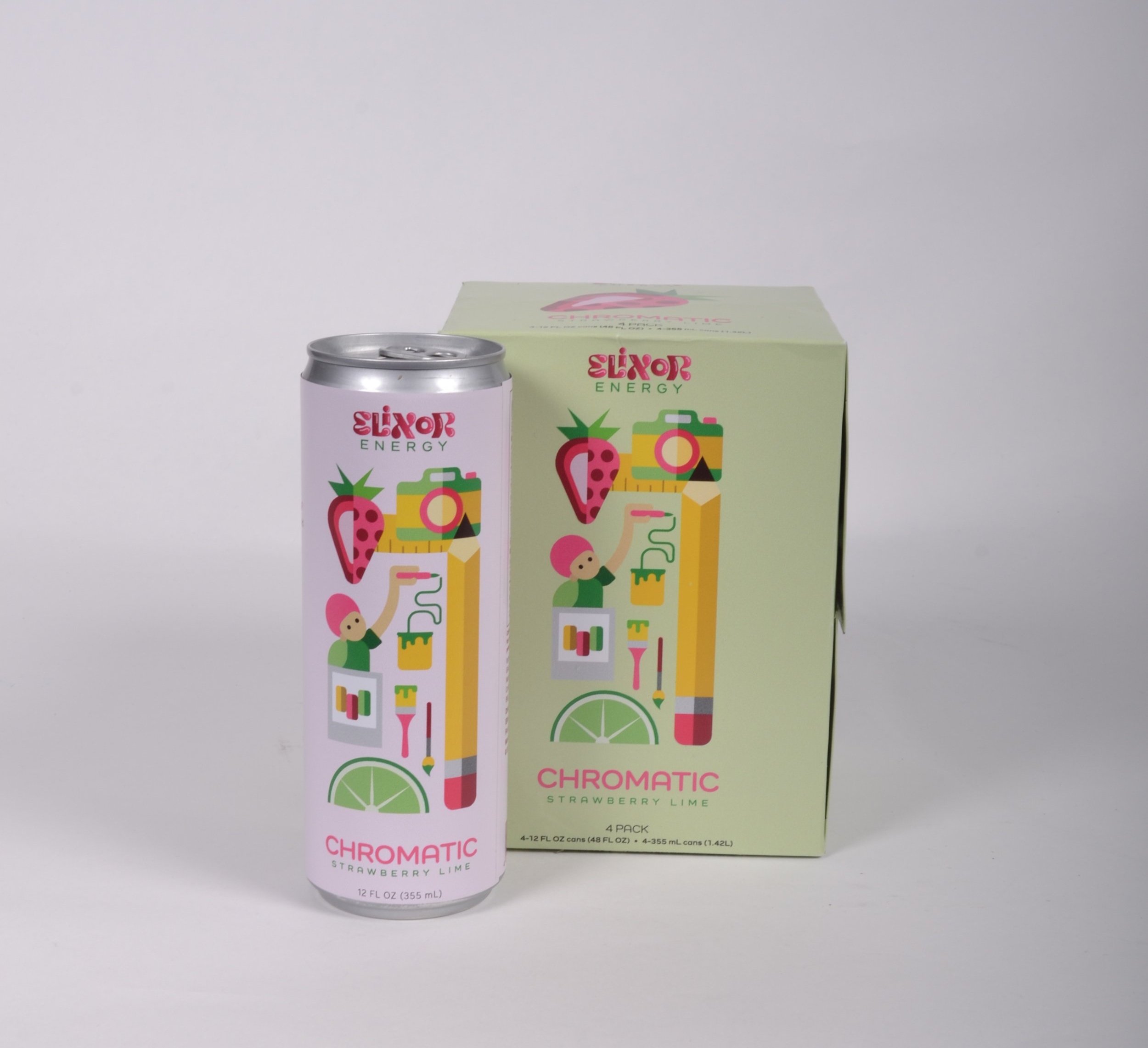
Three (3) 12oz. skinny can designs for three flavors
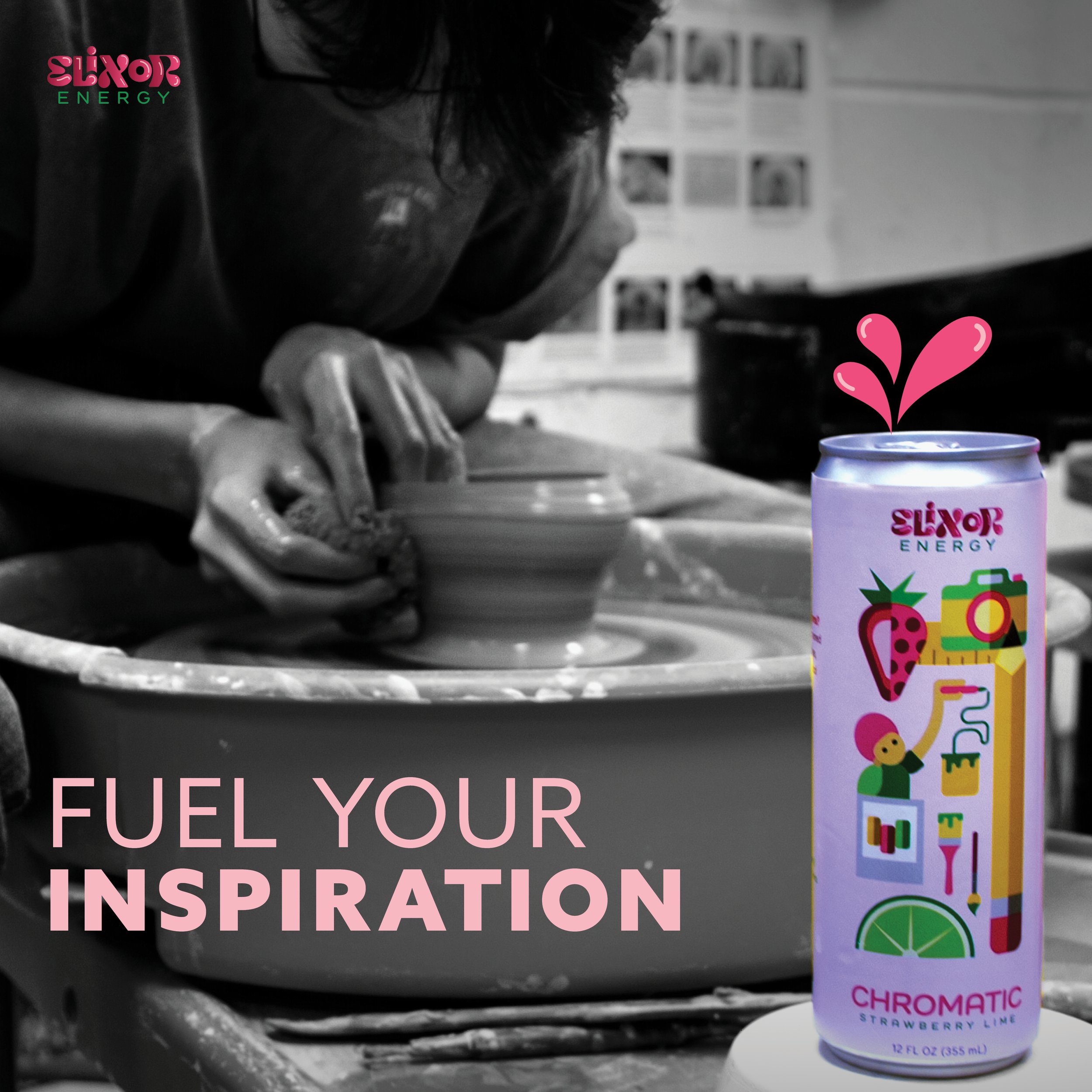
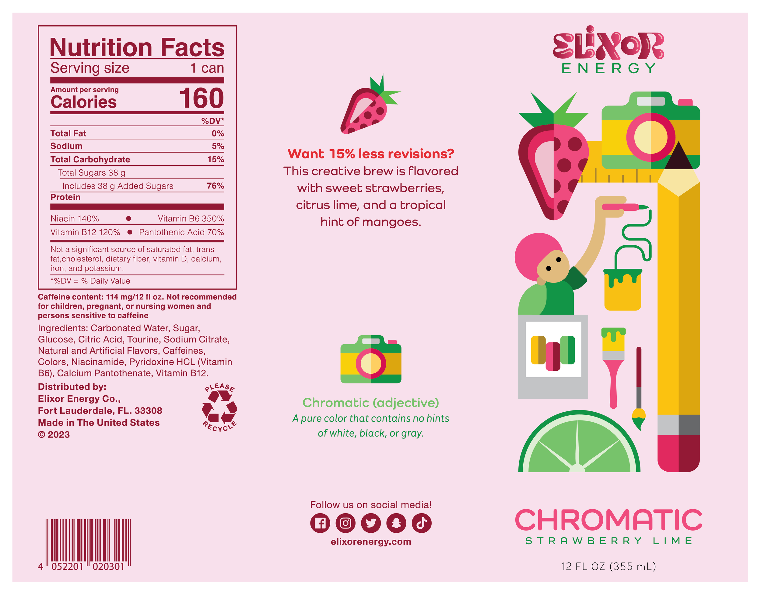
Chromatic Strawberry Lime
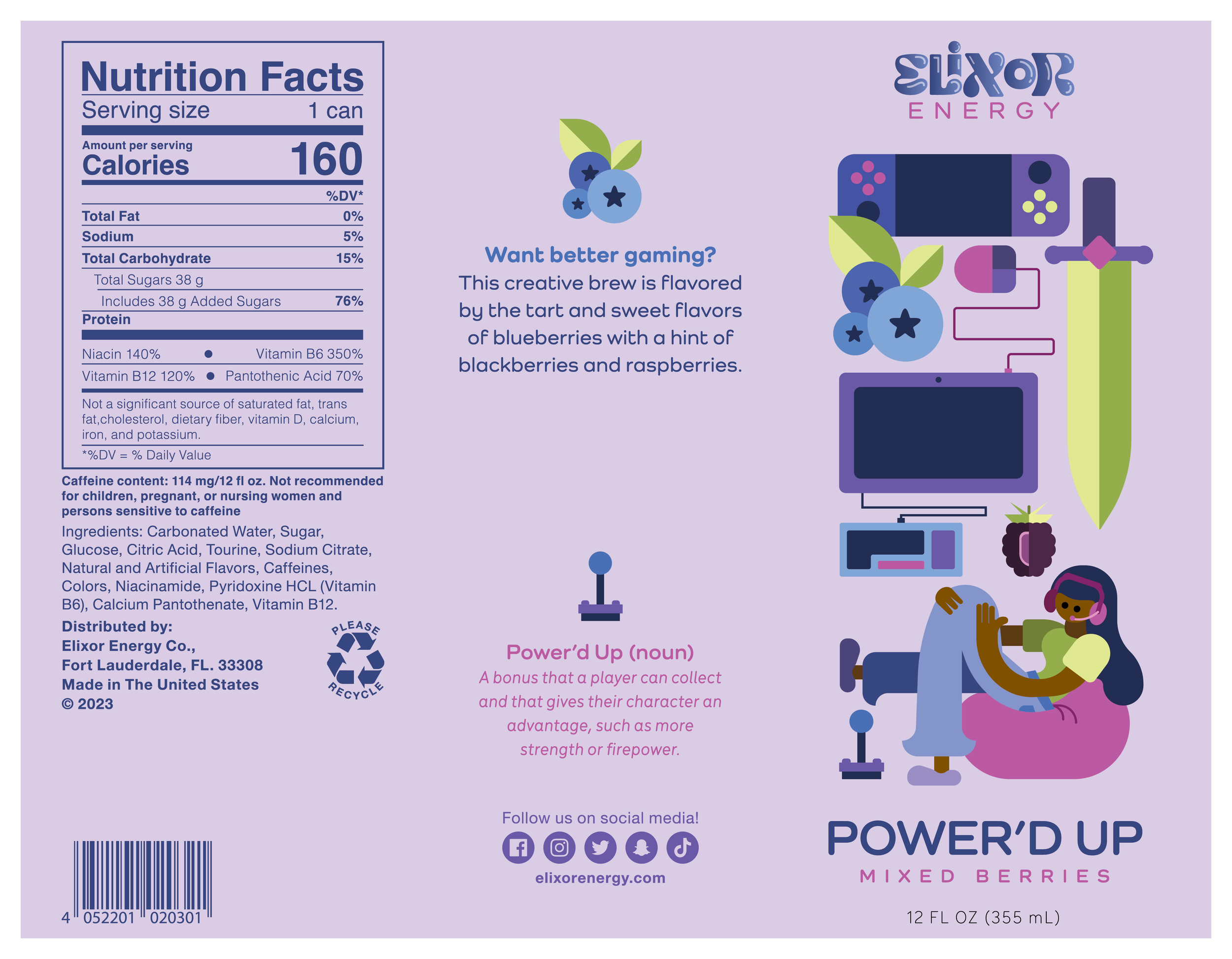
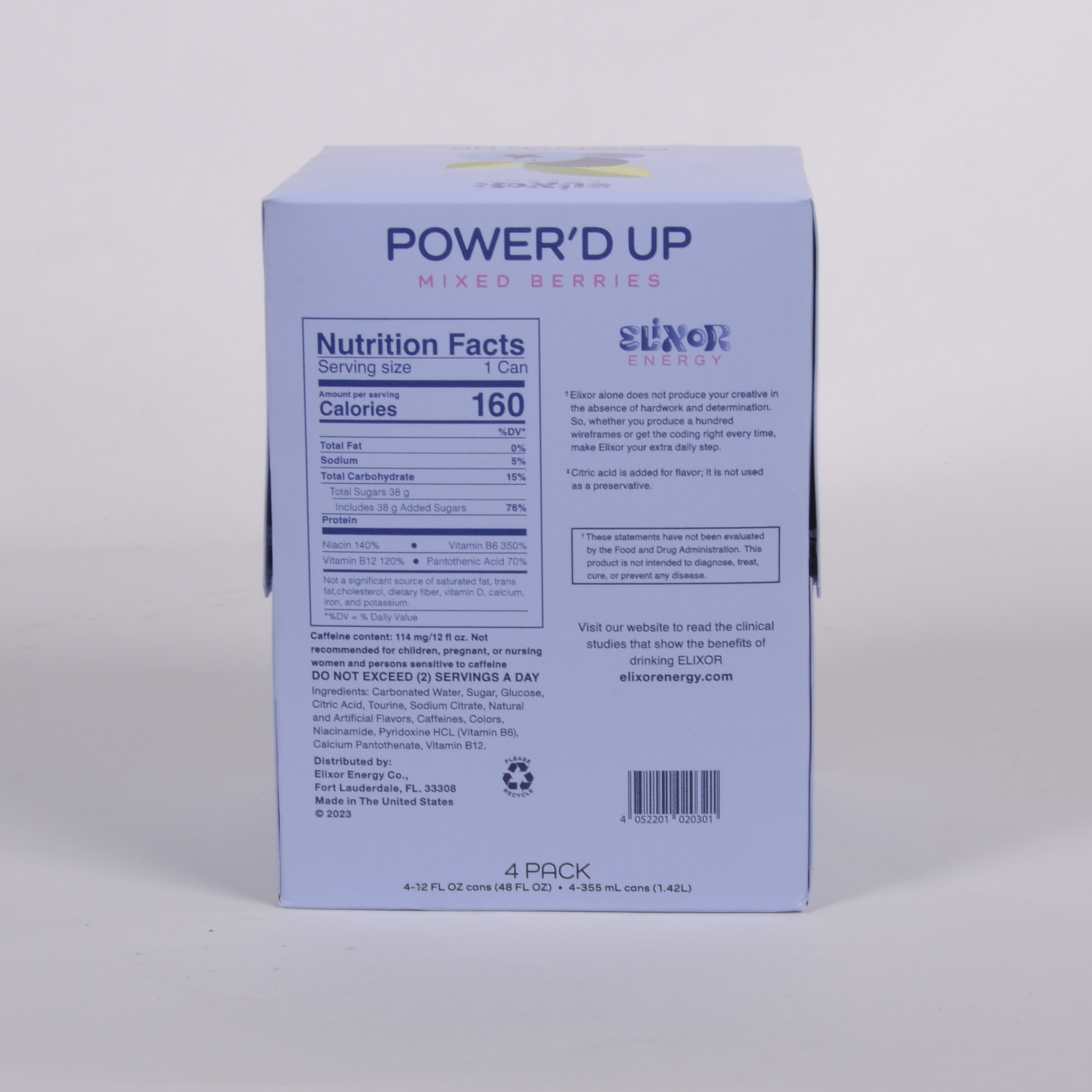
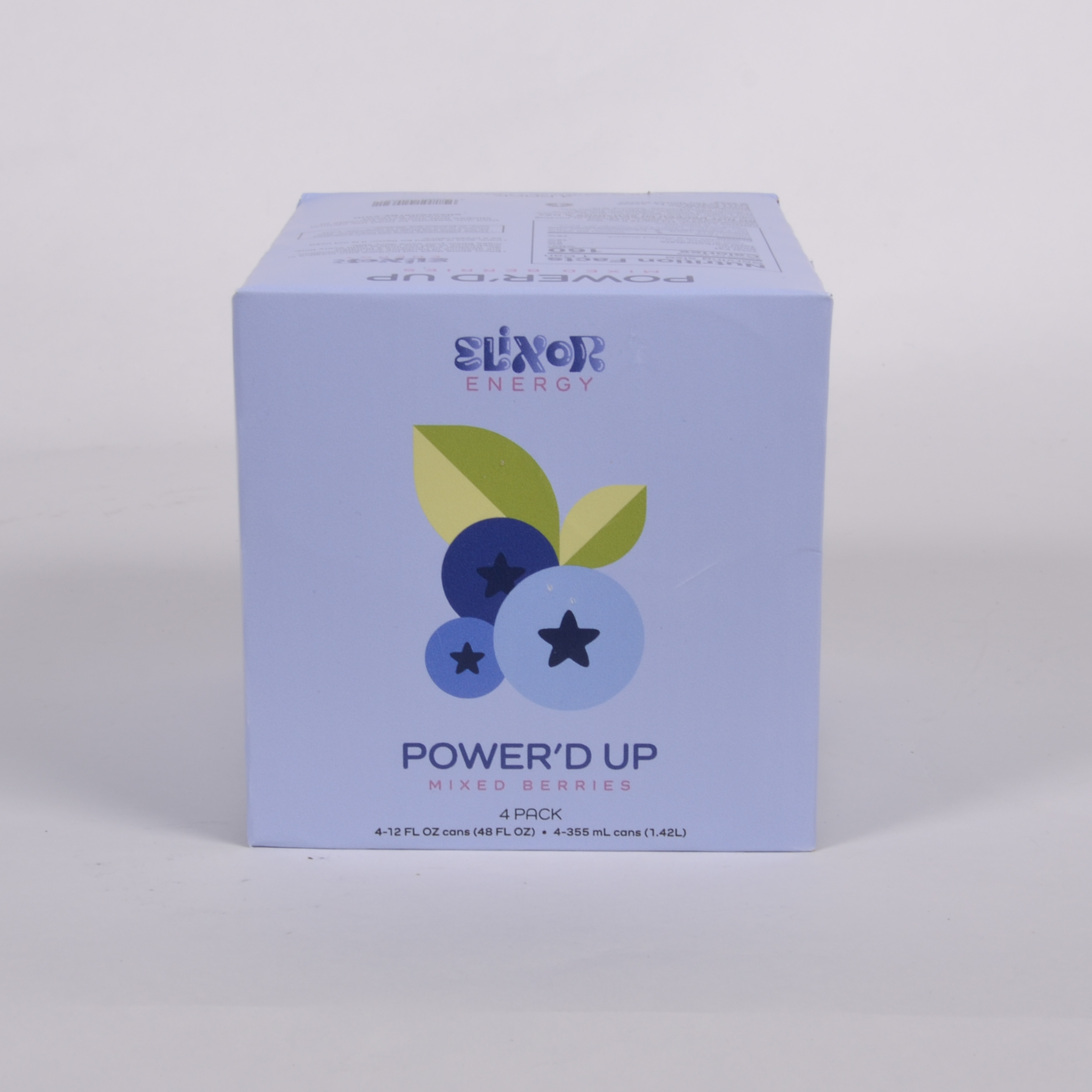
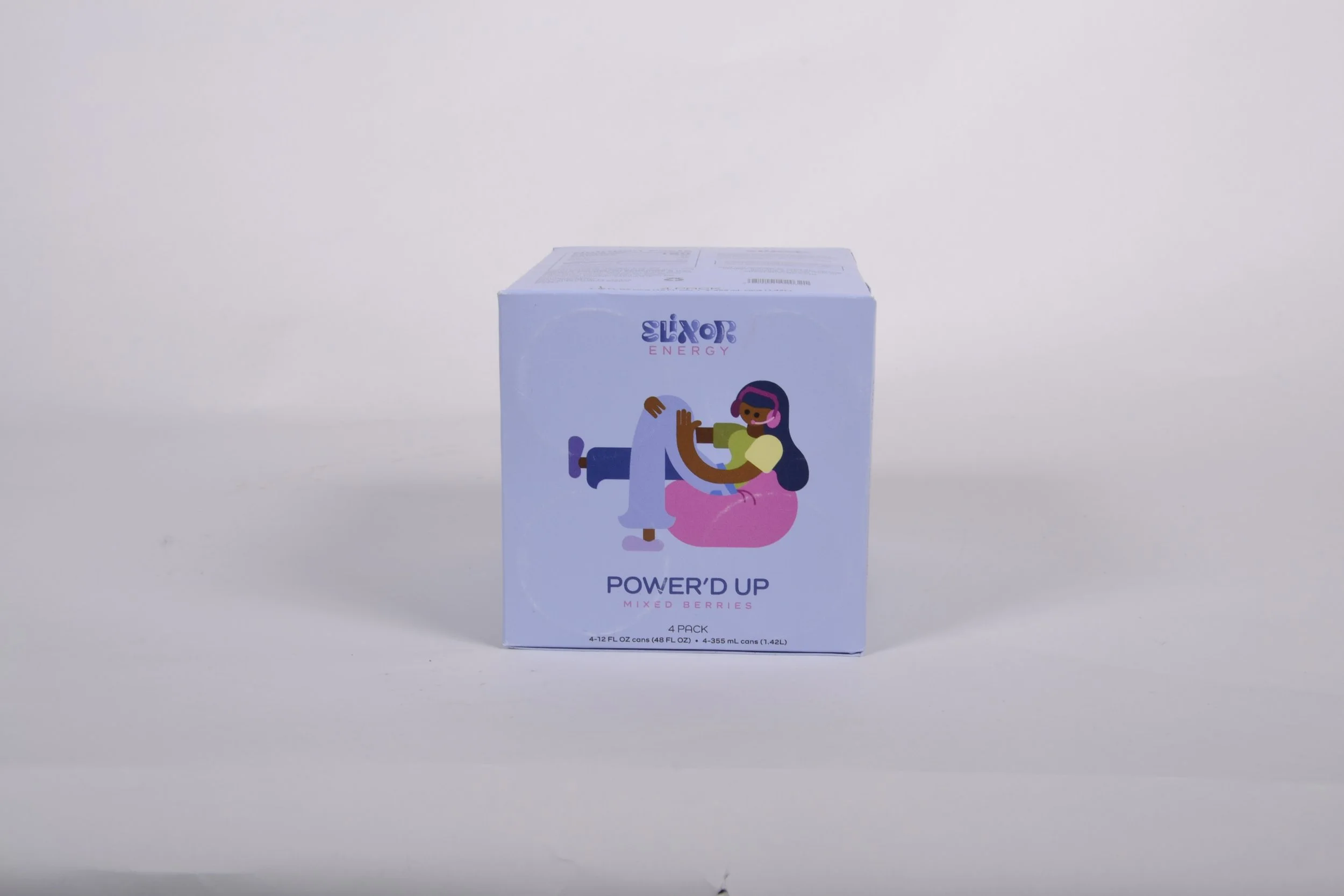
Power’d Up Mixed Berries
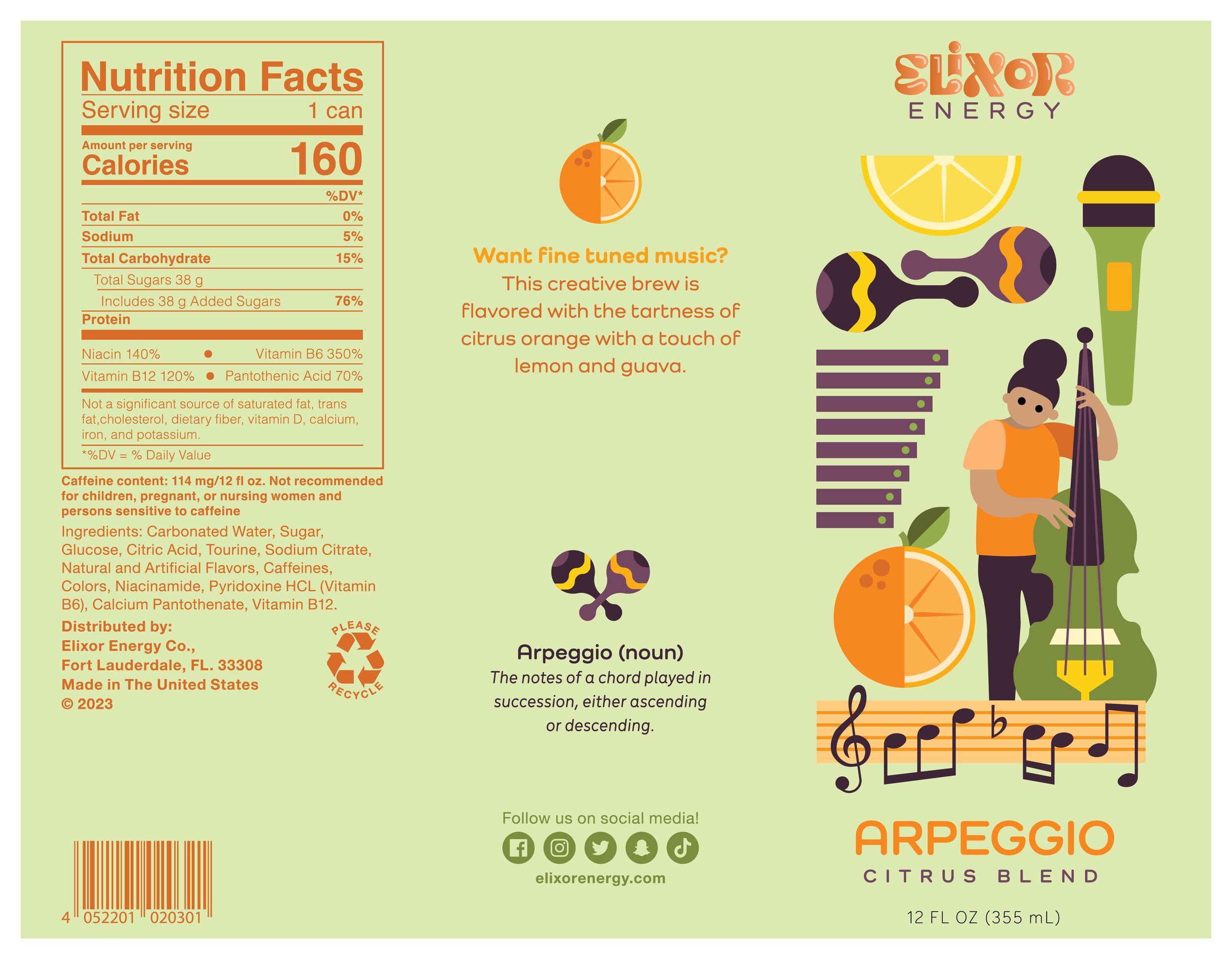
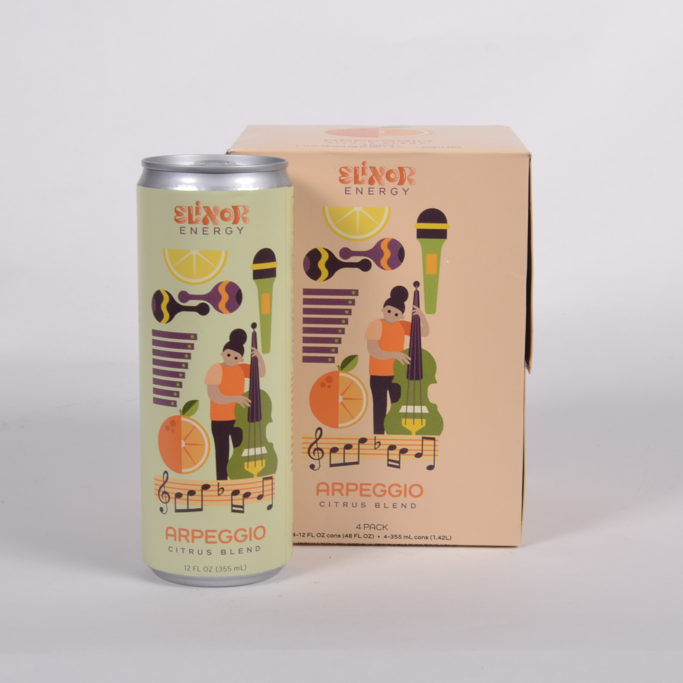
Arpeggio Citrus Blend
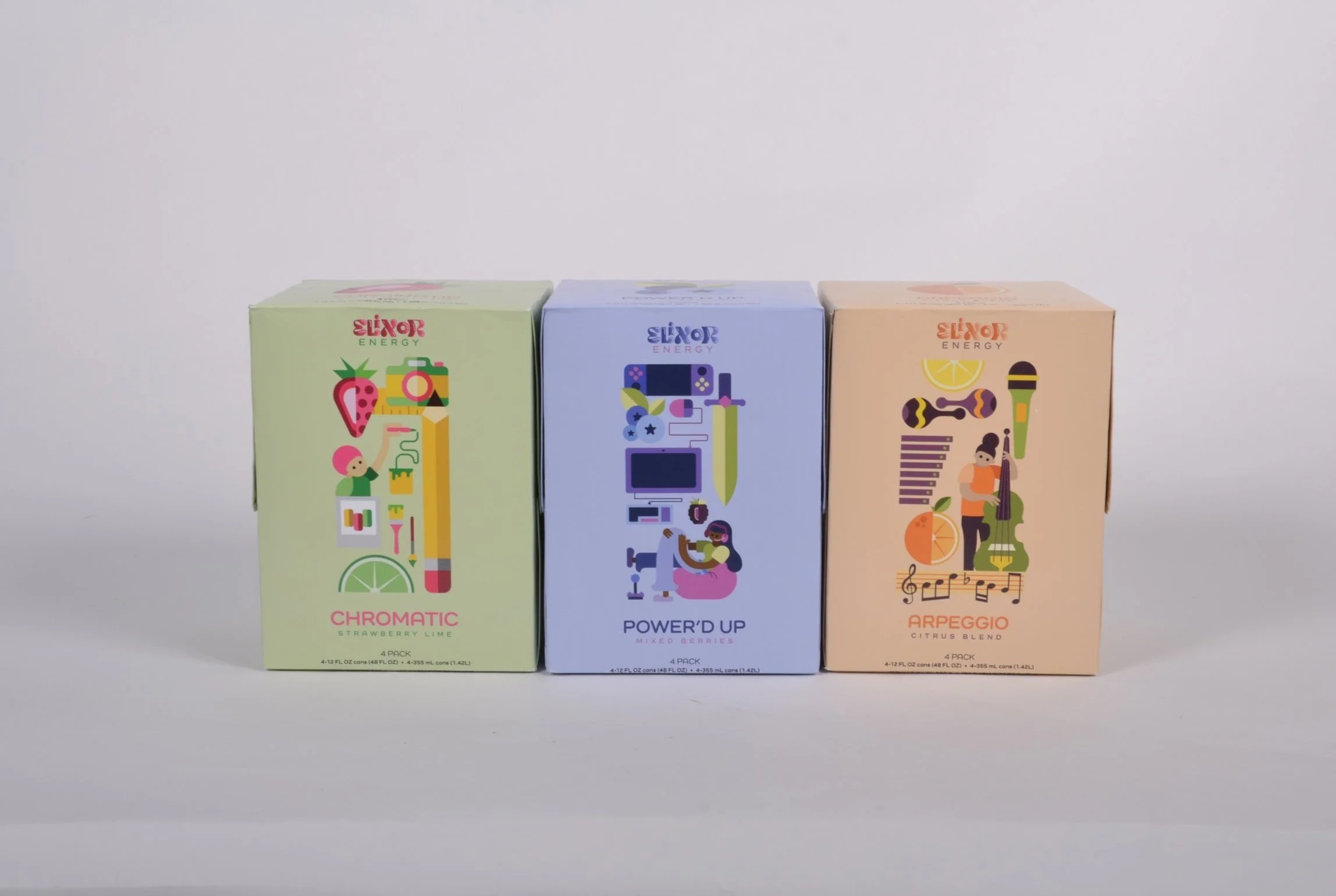
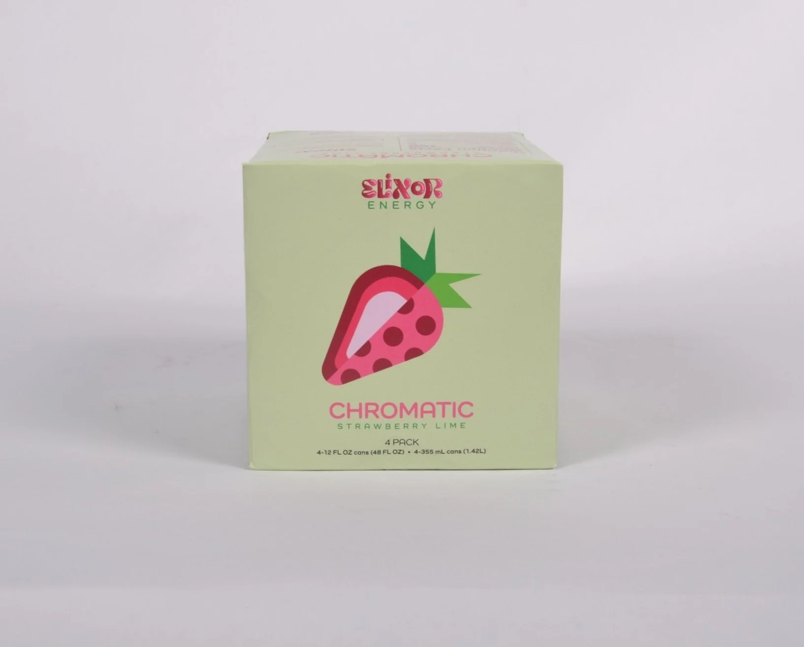
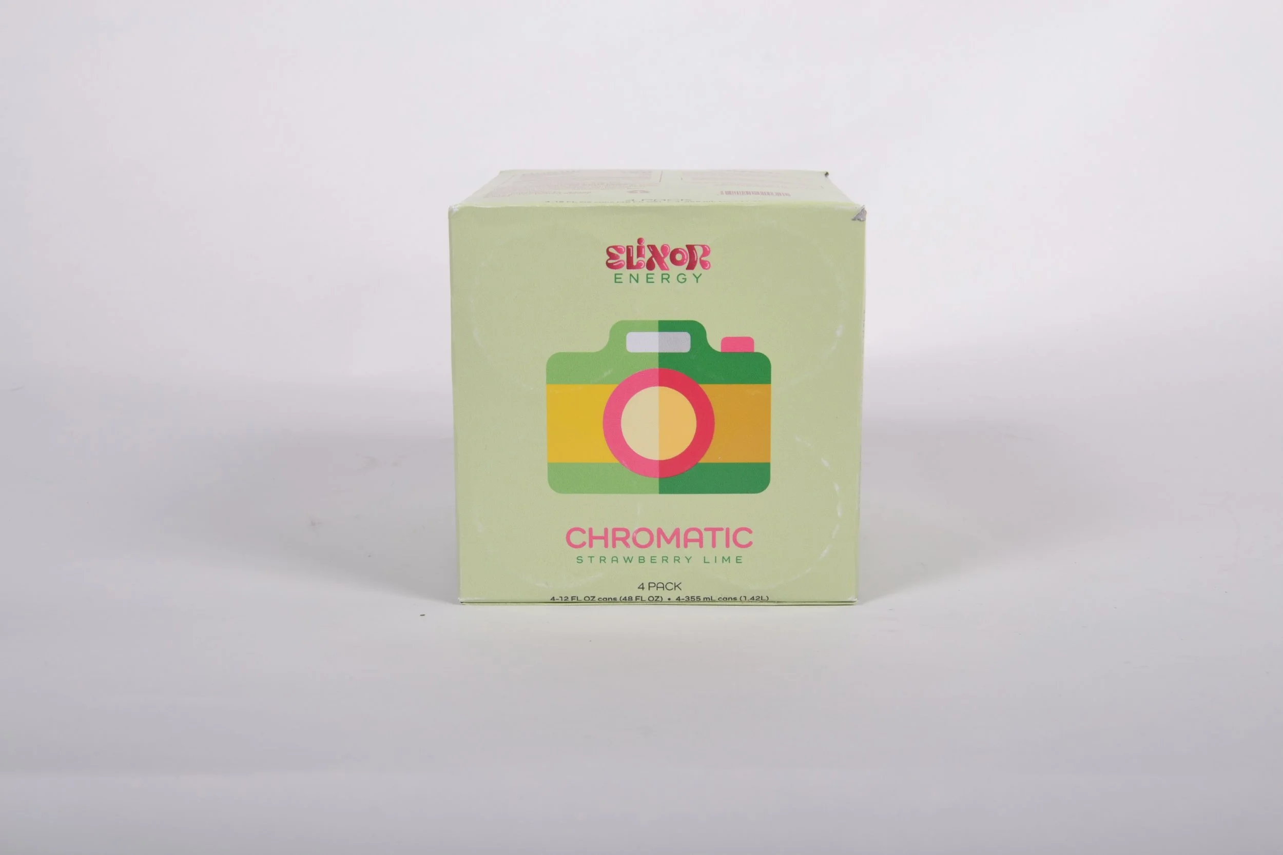
Three (3) four-pack boxes for each flavor
In-store display stand
Instagram Marketing Campaign that includes the following:
Nine (9) tile/square marketing set up
Two (2) promotional ads
One (1) reel/video advertisement
About the Company
I created Elixor Energy as an energy drink company that supports and stems light onto creators around the world today. As a creator myself, I wondered how I could combine two things I love – energy drinks and caffeine and graphic design. It felt like the right solution to create this product because the energy drink market is popular today and heavily being followed by young to middle aged people, so producing a product within this industry that has a different concept than seen before, the idea and marketing portion of this felt correct.
The word elixor is a portmanteau of the word’s elixir and creator. Elixirs are magical potions that are mostly associated with positives such as love, passion, etc. This mixes well when considering what creators are doing - something they love and have a passion for. So why not provide that energy for those creators to continue being great at their passion.
Target Audience
The main target audience will be those who are creators and are between the ages of 18 to 35 years old that enjoy caffeine and energy drinks. Hubspot took a survey and calculated that 70% of that aged target audience considers themselves to be a creator. It was also stated in a different survey that 93% of Americans consume caffeine in some way, shape or form.
Objectives
To independently research, design, and produce a logo, packaging for three 12 oz. skinny cans, three box designs for a four pack, an in-store display, and a social media campaign on Instagram for Elixor Energy that includes a 9-tile puzzle feed, 2 promotional ads, and a video ad.
To solve the problem of an effective yet interchangeable package design that’ll fit different flavors.
To illustrate design properties to convey the theme of the brand through the PDP of the cans.
To model proper decision-making skills to successfully complete the project task at hand.
To apply the use of design fundamentals and practices to create a great working design across the deliverables.
To develop a brand identity and stay cohesive of the branding throughout the different platforms of the brand.
To generate perfect hand-crafted models of each physical deliverable for a proper assessment of the product in its true nature.
To present the new brand and elements with poise and professionalism to all viewers.
We’re Getting Somewhere…
Research Synopsis
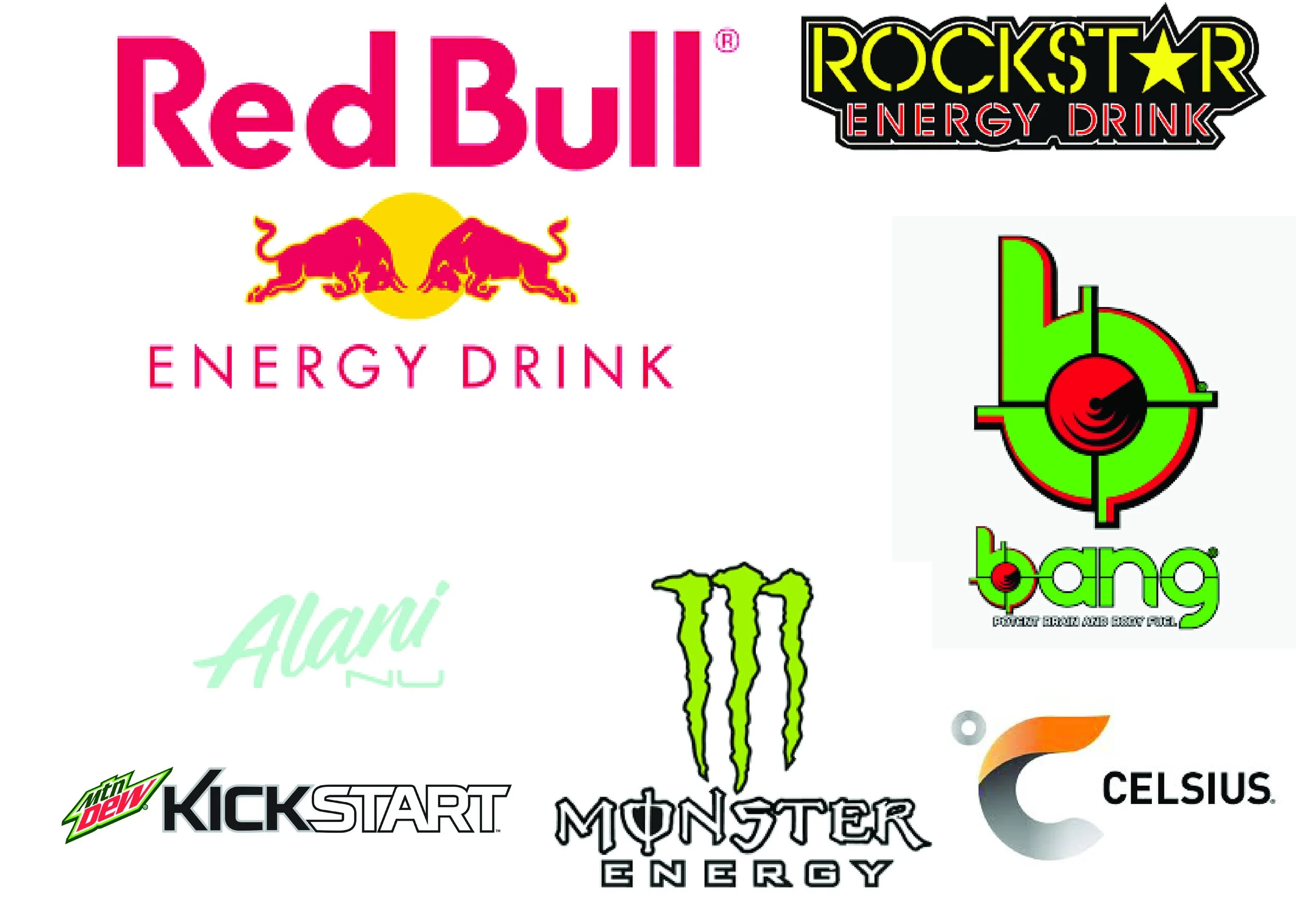
To research, I begin by researching my competitors in the energy drink industry. This research was to compare logos, designs, mission statements, company aesthetics, and target audiences. I built 2 different moodboards – the first being comprised of the competitor’s logos and how they stand out amongst each other, what makes each most memorable for their audiences, and picking up the common theme of energy drink logos/company output. I chose three different companies to mainly focus on and compare to which were RedBull, Bang energy, and Celsius.
The difference between these three companies are more commonly their times in the industry and their rise to credibility during their time. RedBull is a company that has been around since 1987, starting off with energy drinks but later evolving into an umbrella company to many other things such as sports teams, sponsorships, and creative arts. On the other end of the stick is Bang Energy, which has been around since 2012 but has recently gained great popularity. Although around for that time, it is not as developed as RedBull and is more directed towards a younger audience.
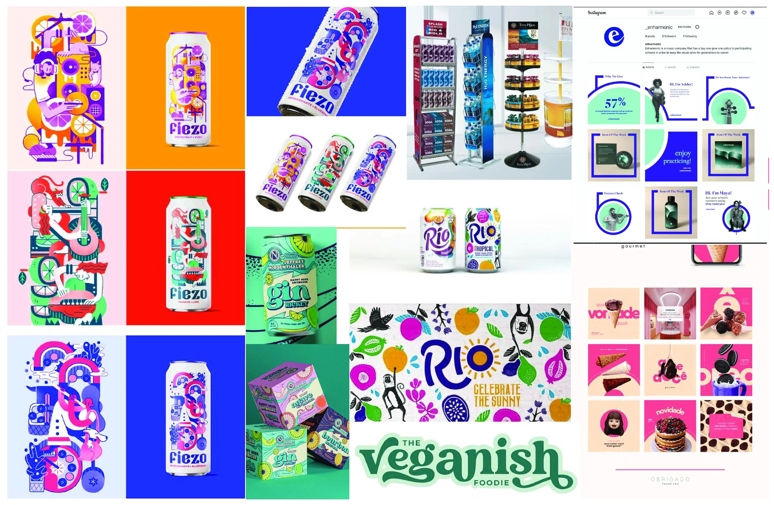
After conducting this research to gain an inspiration from companies and what makes them stand out amongst each other, I took this research and combined it with my own brand, mission, and goals for the company and composed a second mood board for design inspiration. I composed a moodboard that consisted of logos that are more flowy with more structured and grided designs. I lastly wanted colors that would stand out and designs that looked relatively different than you would typically see, especially on energy drink cans.
Process Narrative
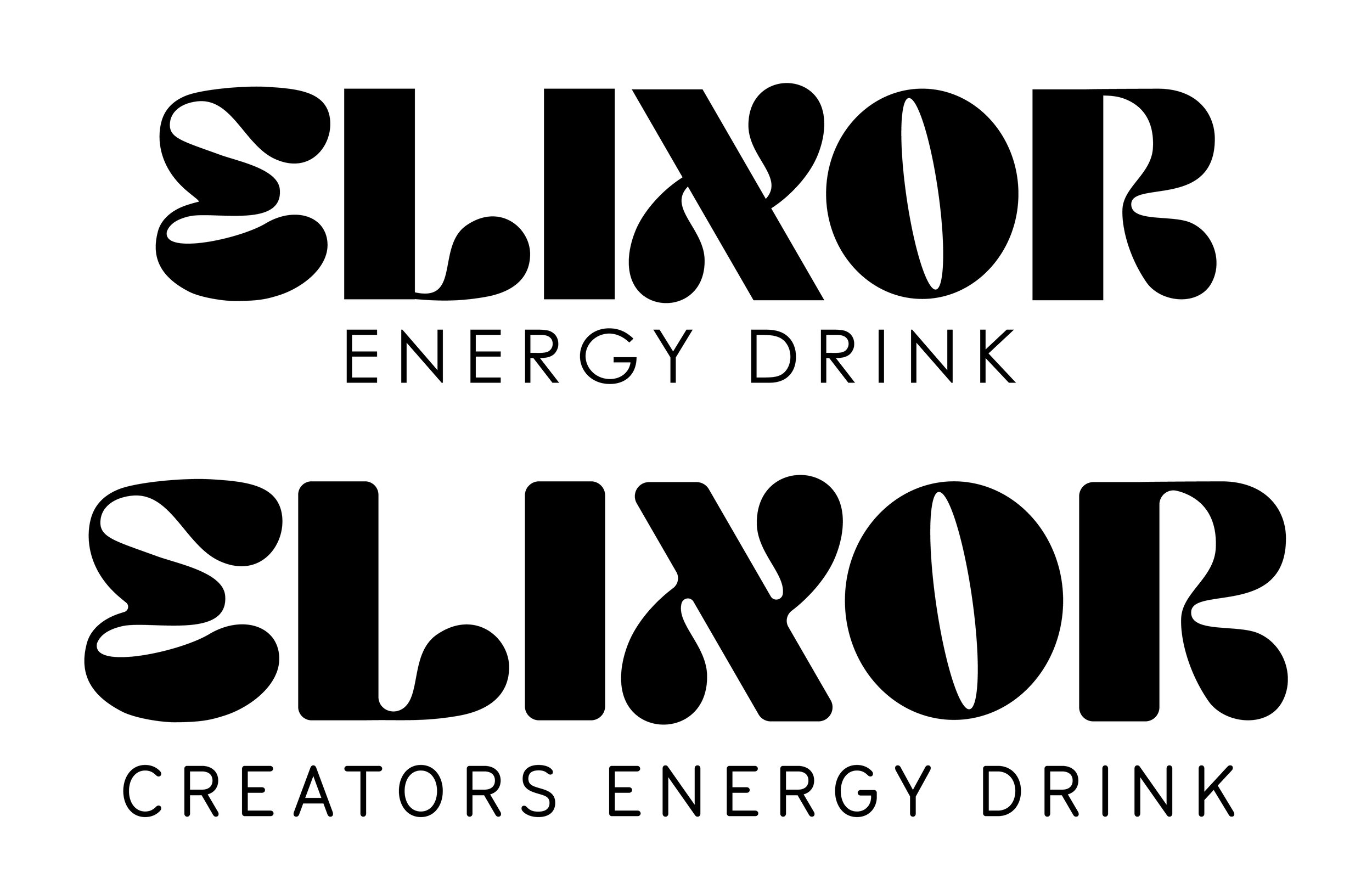
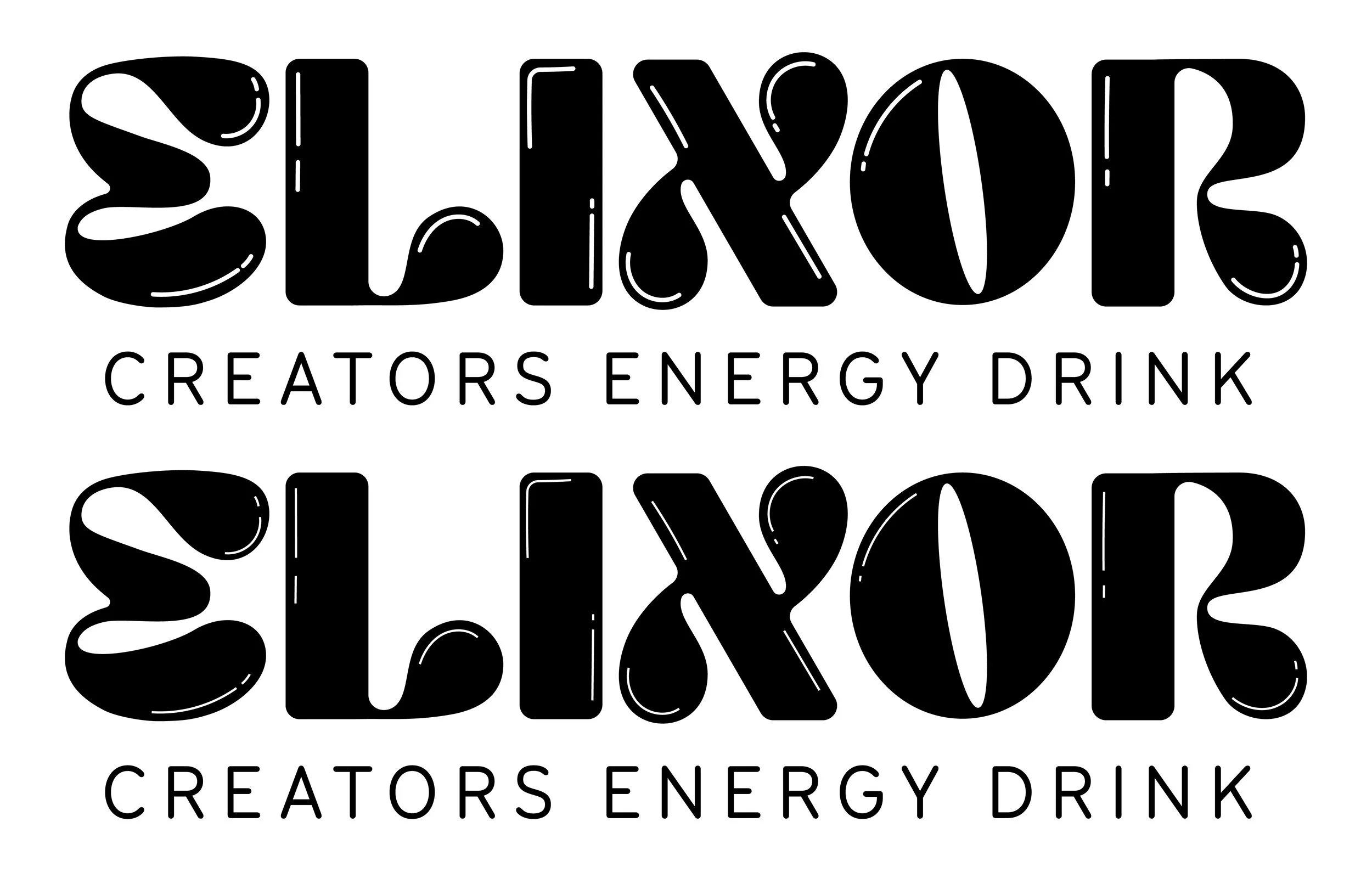
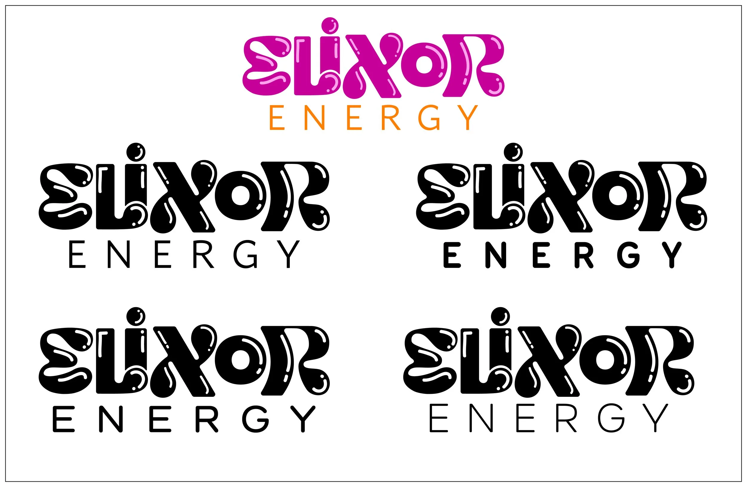
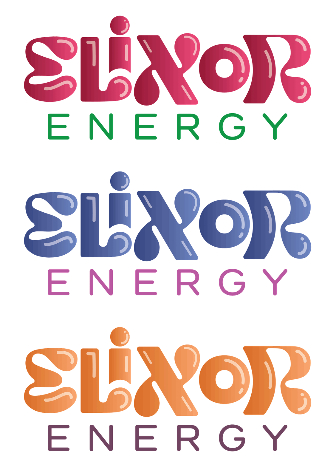
For my logo process, I knew that I wanted to follow alongside the trend of the common energy drink logos and go in a typographic direction. As I envision my future with the company, I considered that creating a logo that was a bit more universal would help the company become more than just energy drinks at some point, much like RedBull. I also wanted my logo to portray the bubbly feeling from energy drinks that you get, especially due to the carbonation that comes from energy drinks as well.
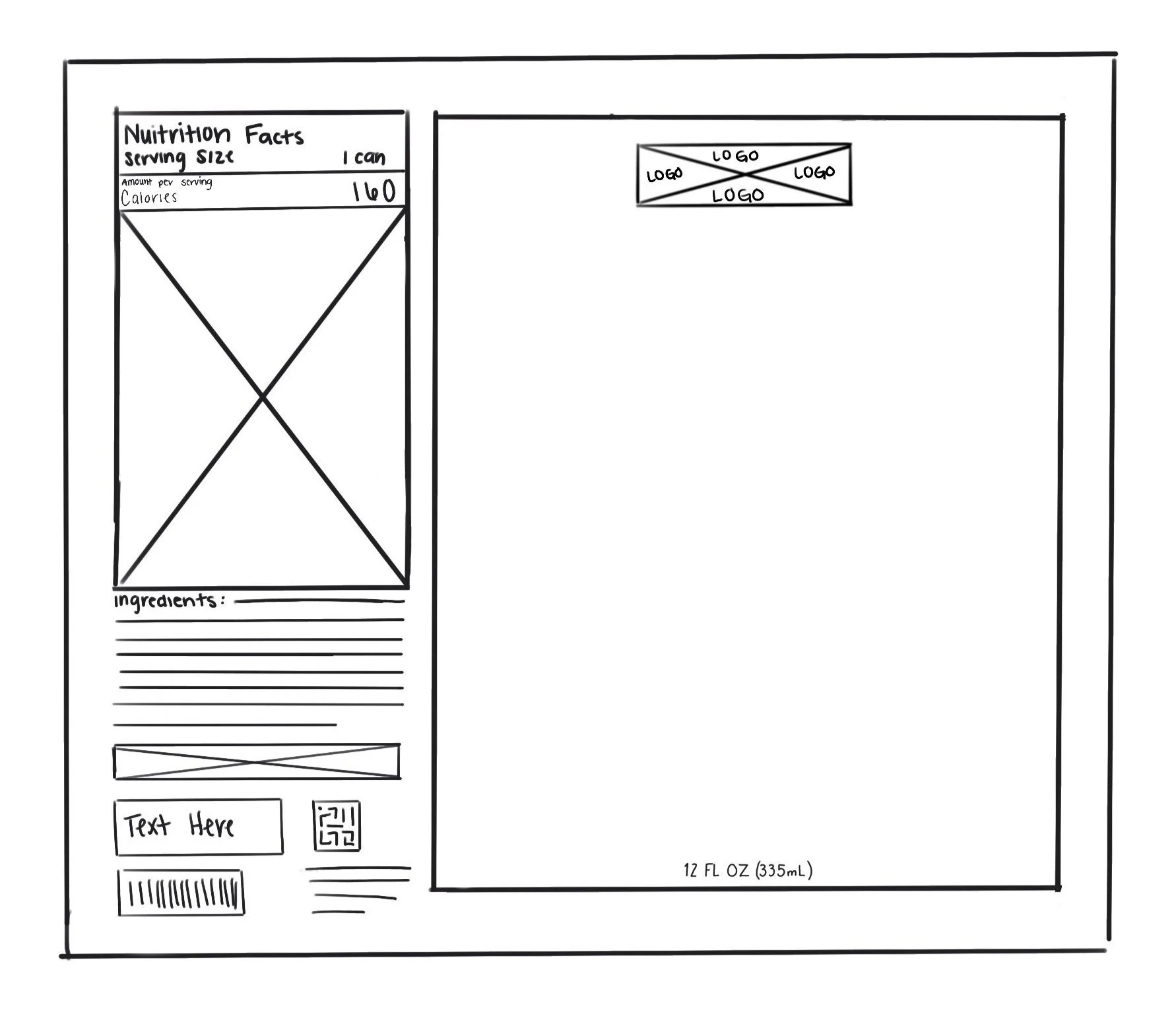
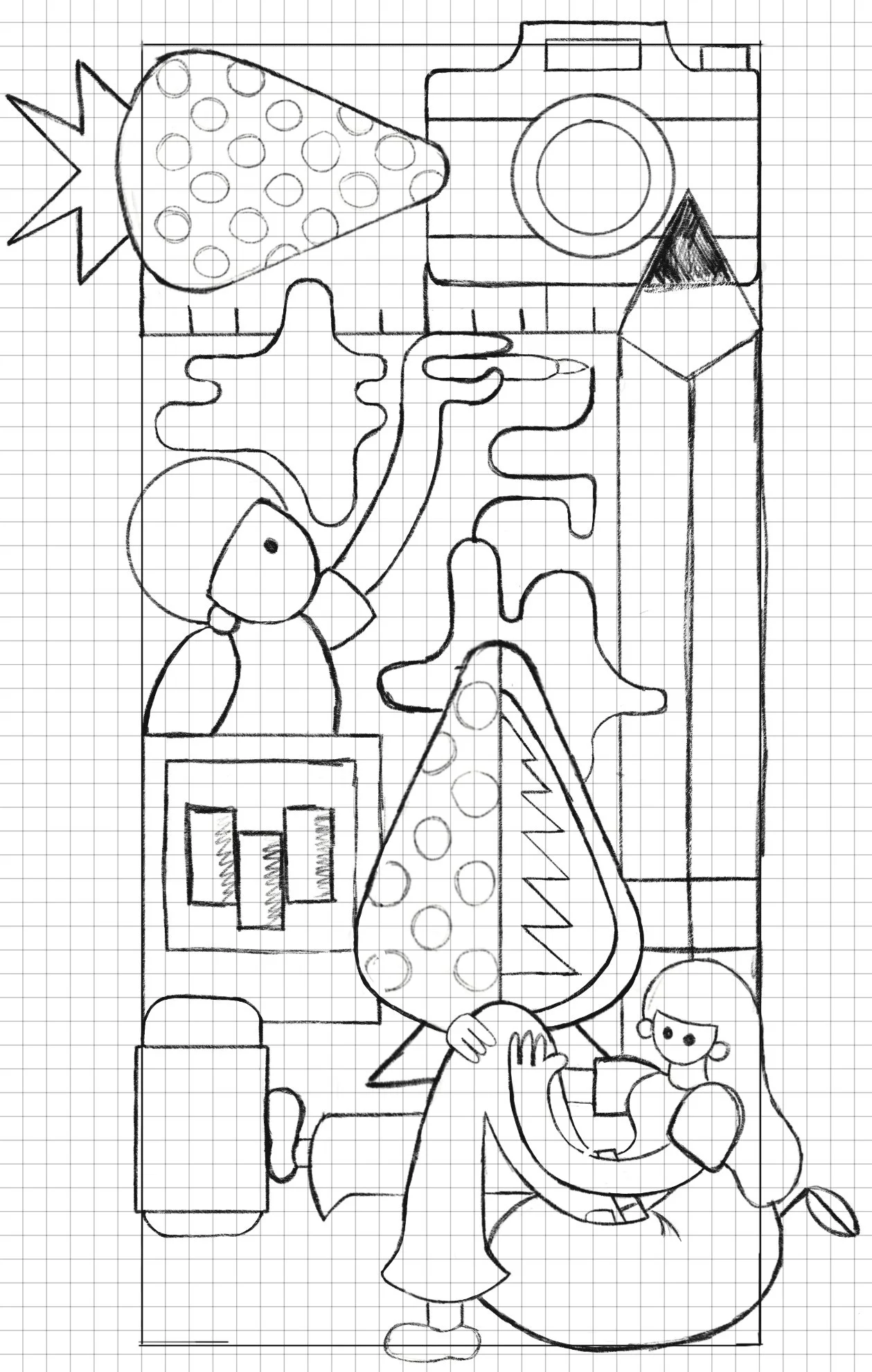
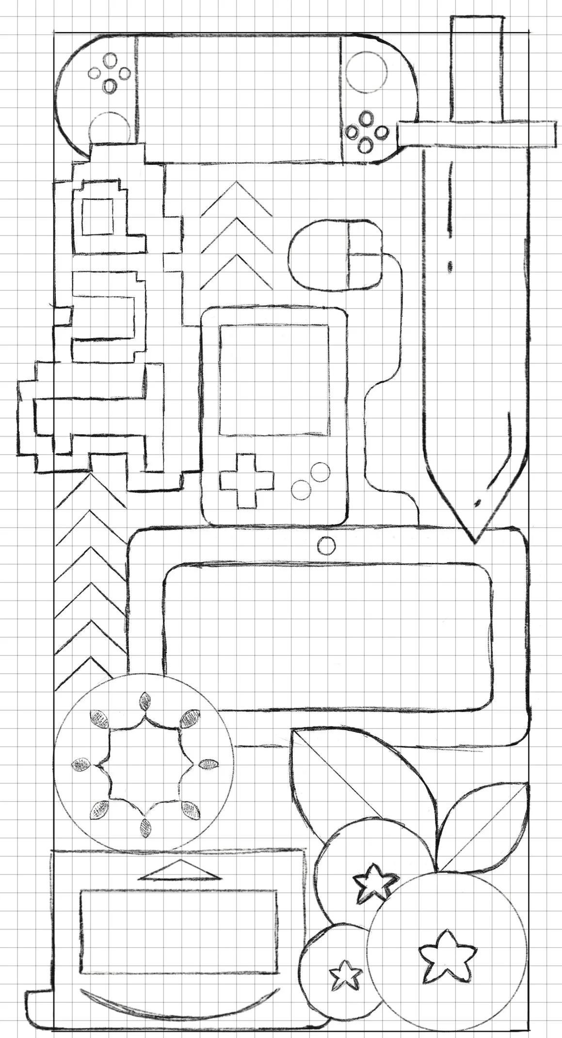
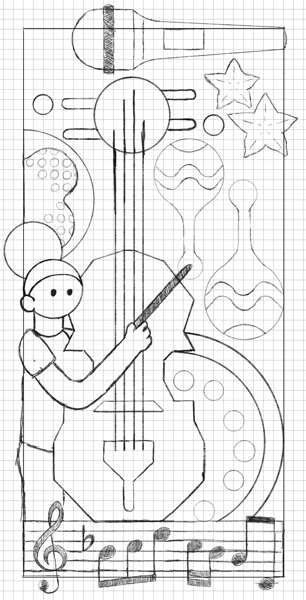
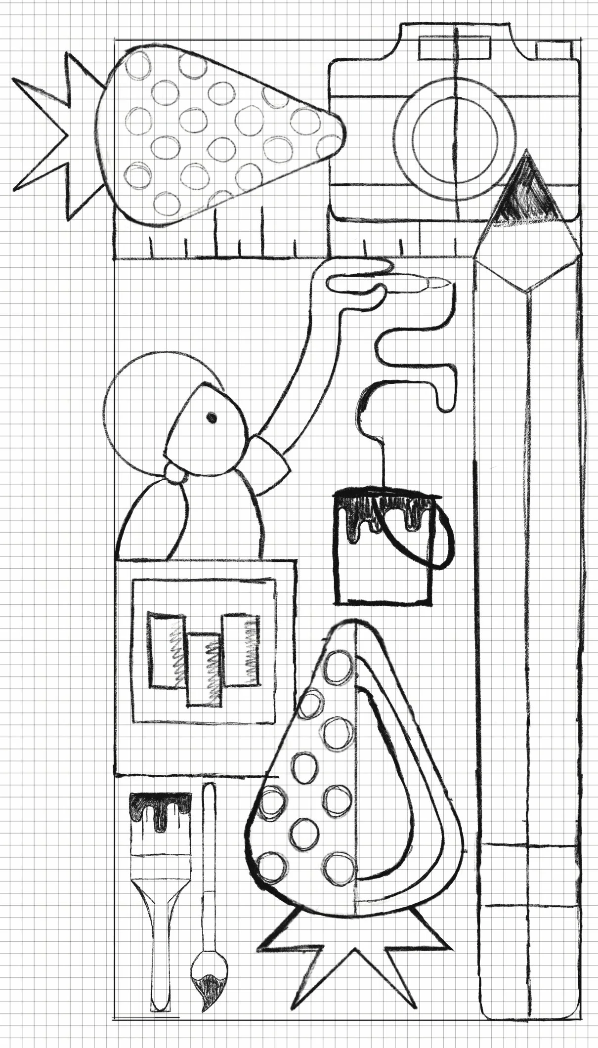
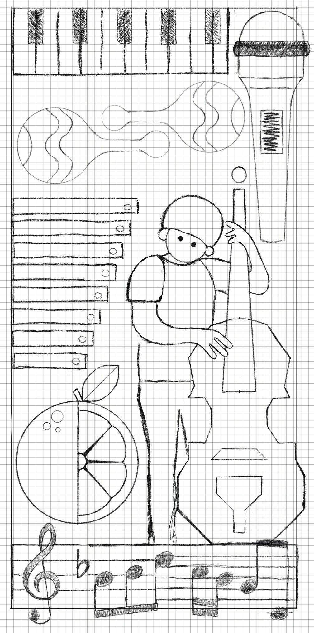
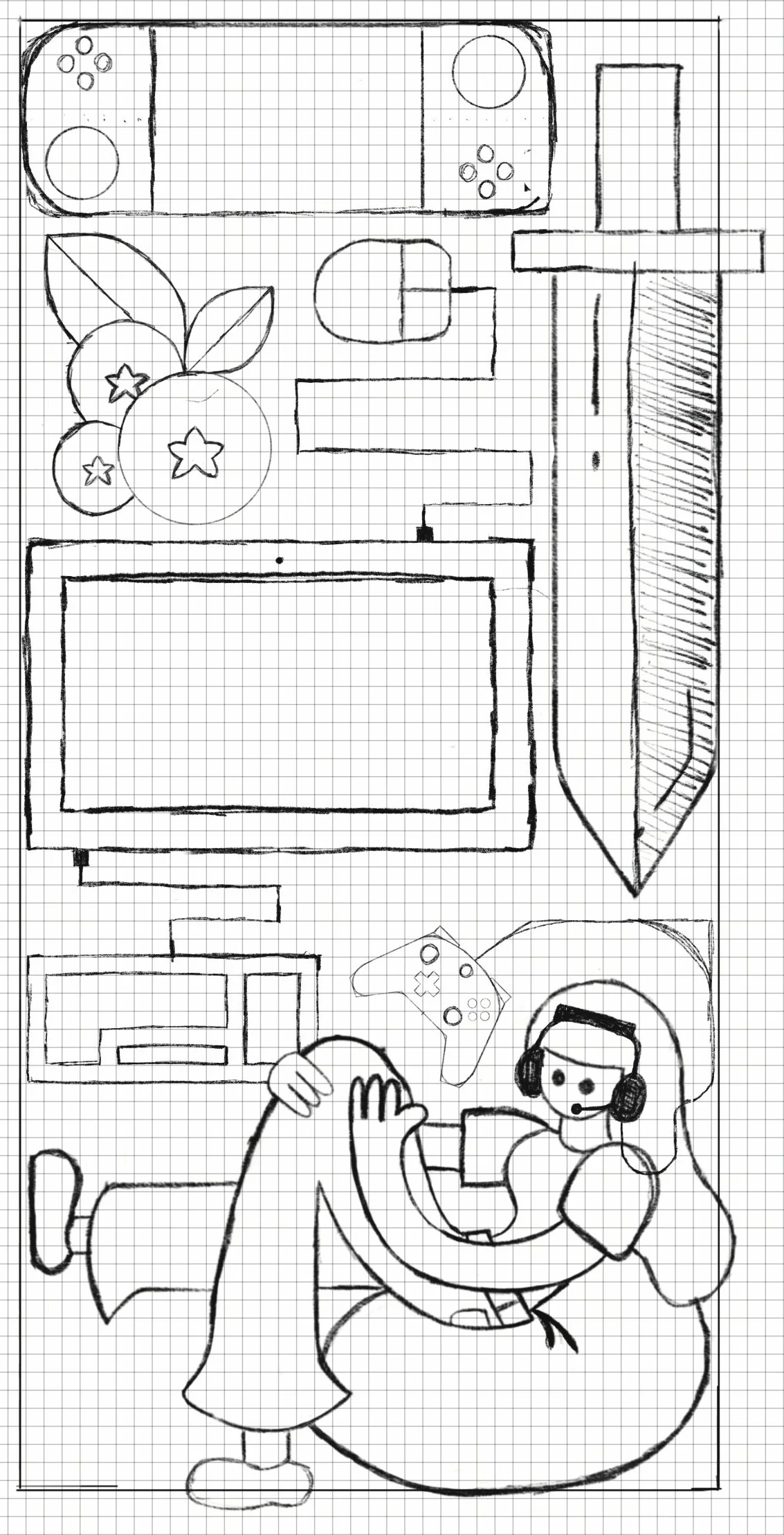
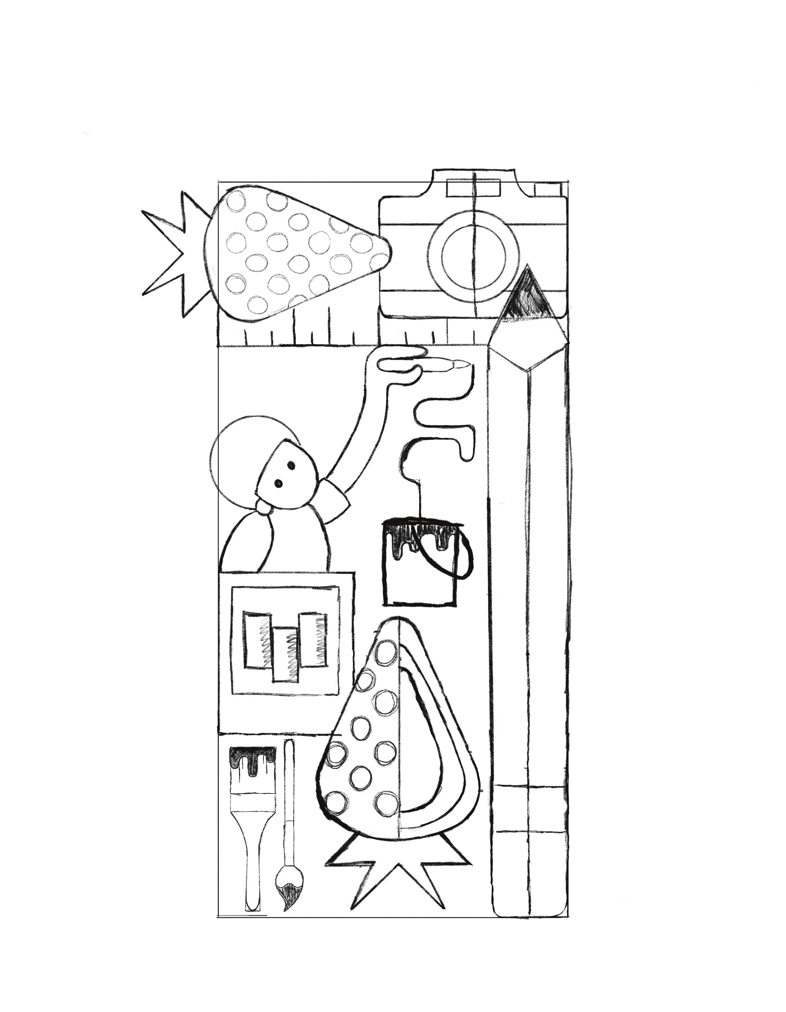
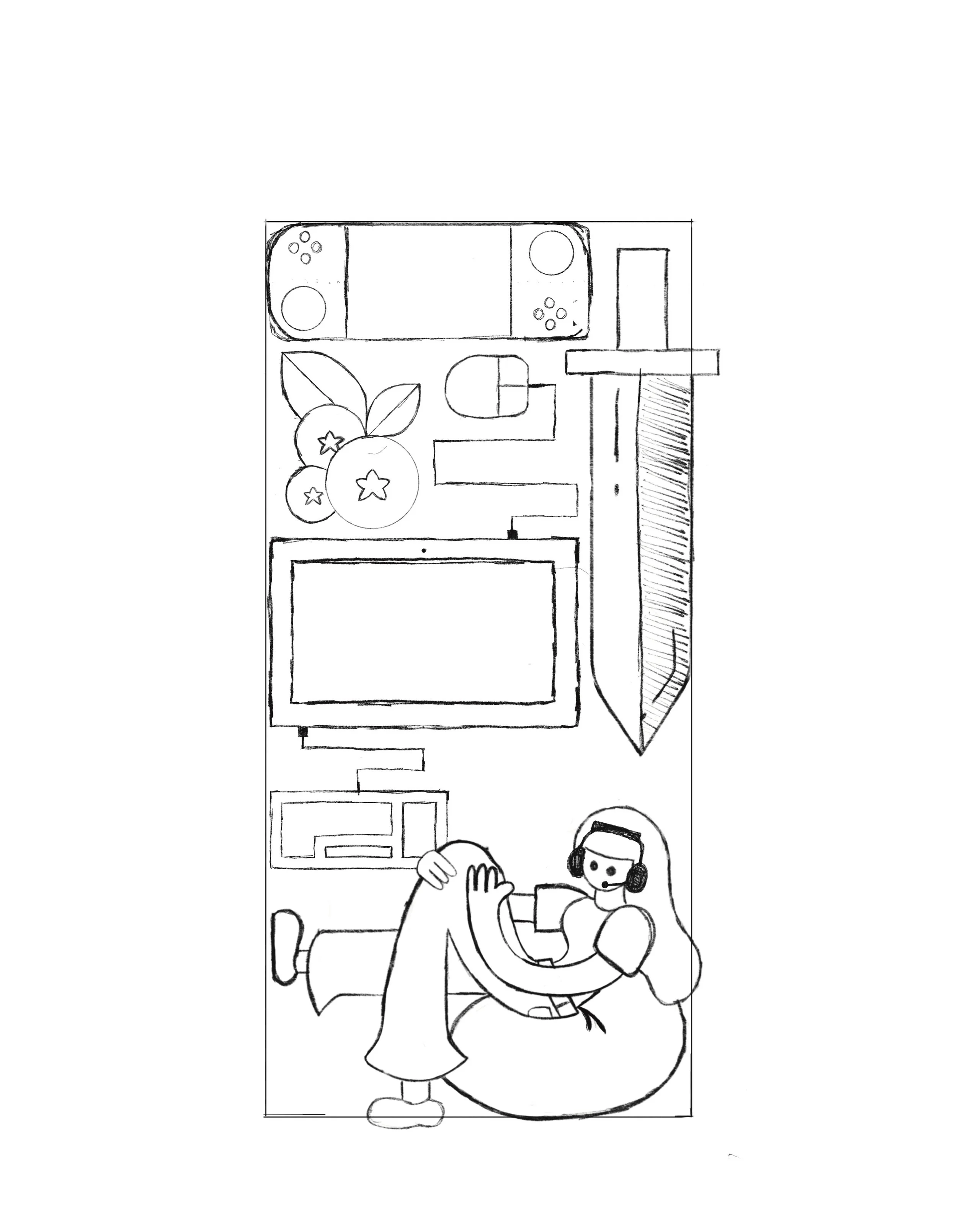
For my flavor designs, I wanted to use a clean and modern design to portray the different areas of creators. To achieve this goal, I used a grid to stay in a structured rectangle as I designed my elements. I also limited myself to a color palette that consisted of 3 colors and being able to use their tints and shades throughout the design. These restrictions that I gave myself helped to develop geometric graphic forms and stick to a small color palette of corresponding colors to avoid legibility or clashing of color that don’t match with each other. Here are the variations and stages leading up to my final designs.
My marketing components are a combination of these elements from both the logo and the flavor elements that were described. Mixing the two in much larger formats helped to bring them together and create a flowing aesthetic which reemphasizing that Elixor can flow through your body and help you fuel your passion.
The Part You’ve Been Waiting For
The Logo and Can Designs
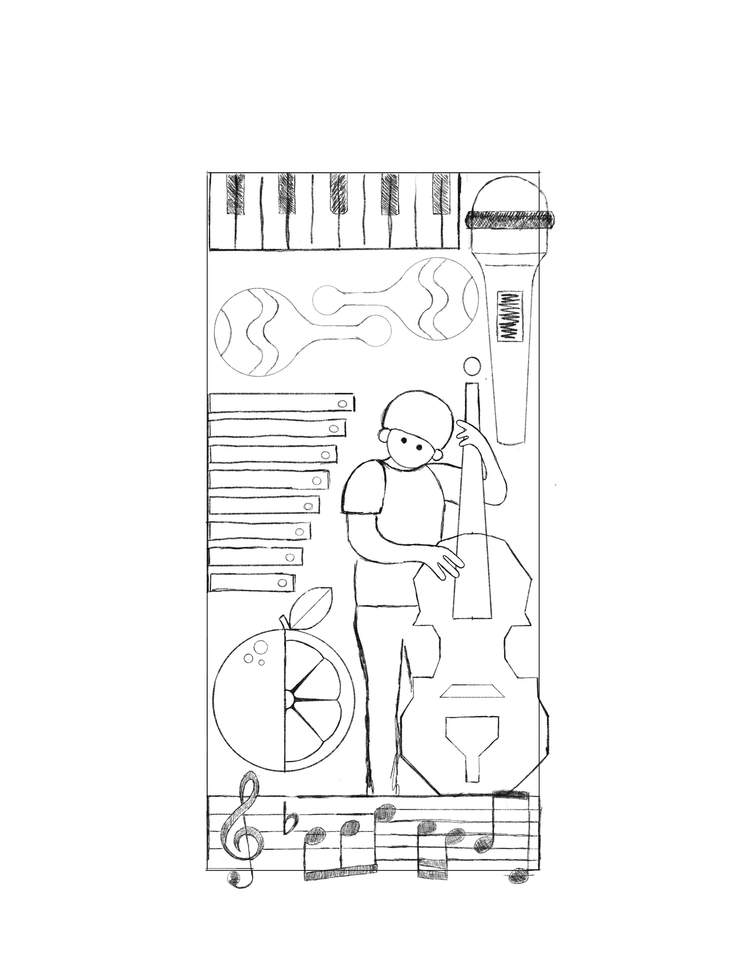
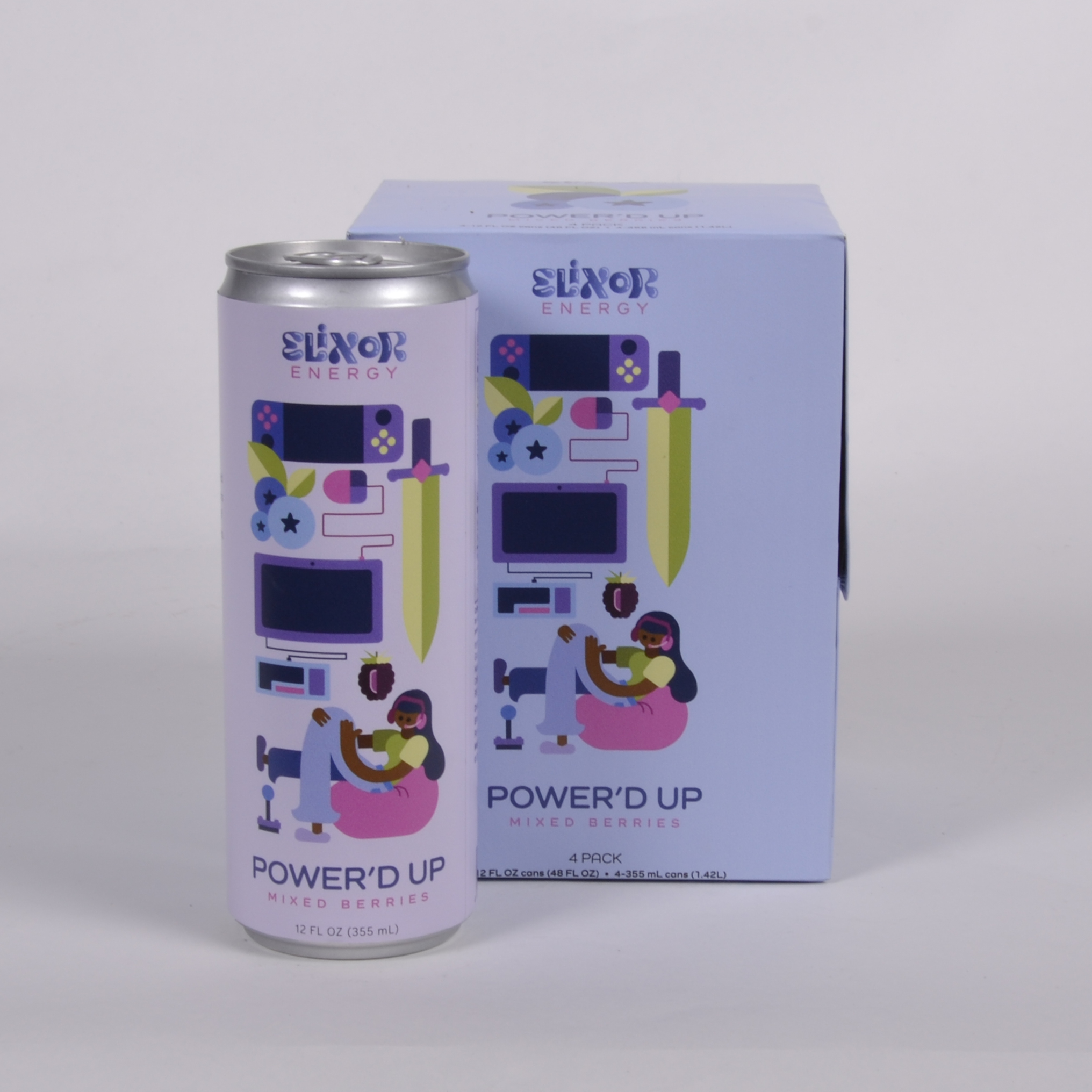
Each energy drink can design has been curated based on the flavor and creative industry behind it. The three types of creators that I chose to pursue are artists, streamers/gamers, and musicians. I chose these three because they all are very popular forms of creation in the world right now and had very notable elements to illustrate. Within each principal display panel (PDP), I illustrated commonly used elements in each field, illustrated each fruit associated with that flavor, and included a human figure in that environment, as it would help the customer feel more connected to the drink. After choosing the flavor names, I used the fruits as a direction for my three-color palette. Within each PDP, the logos colors are interchangeable to help it associate with each design concept accordingly and never run into clashing instances.
The Four Packs
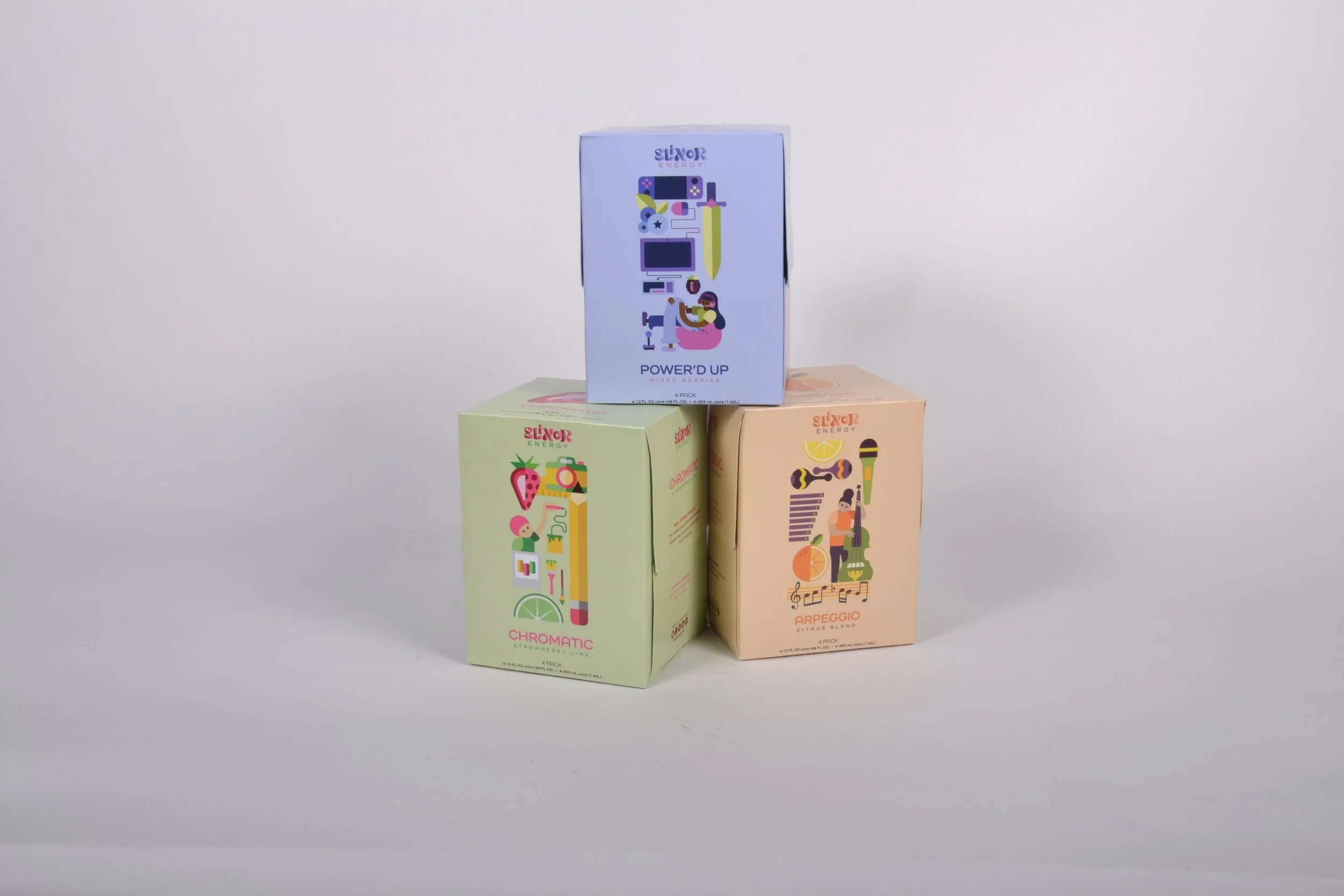
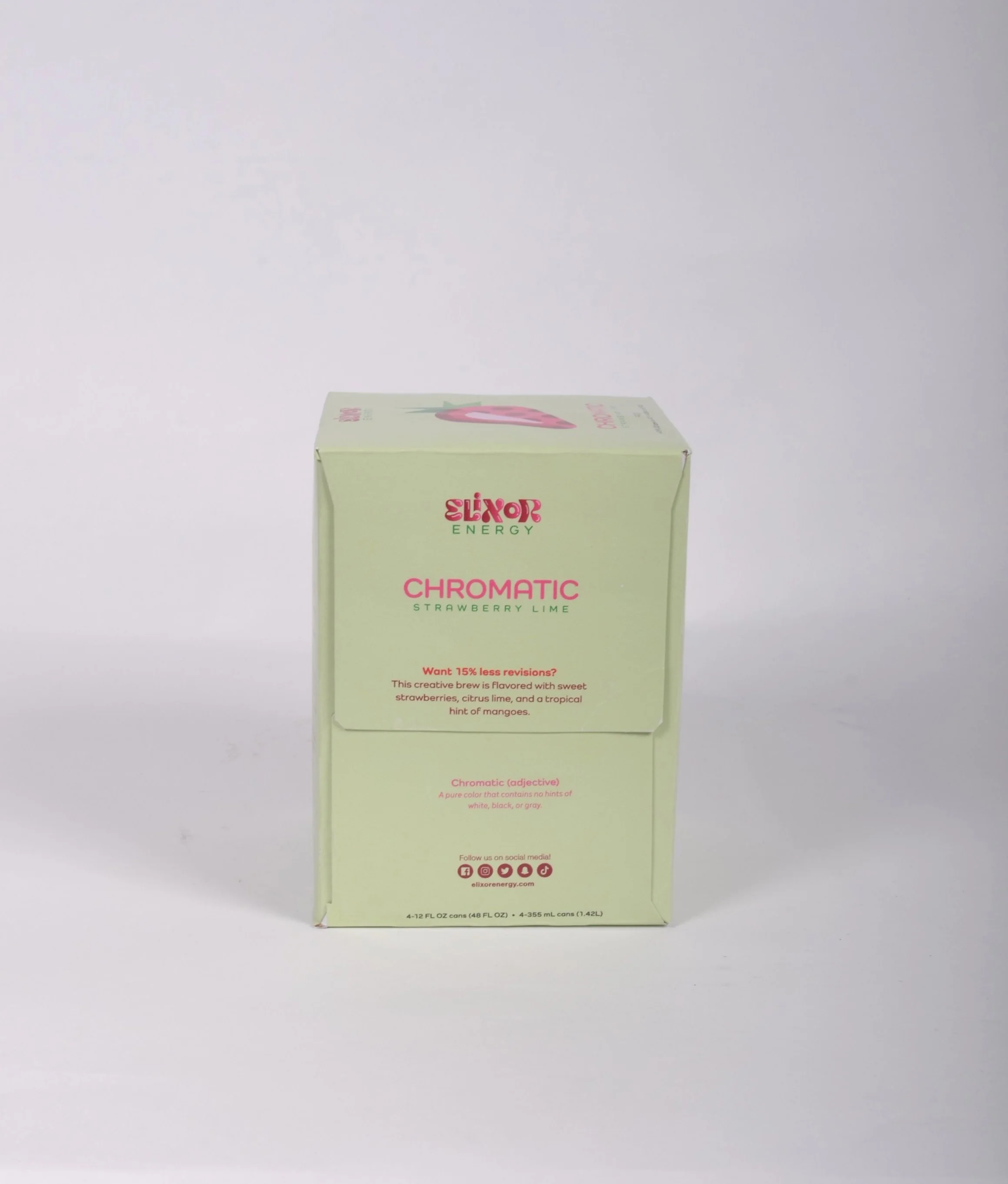
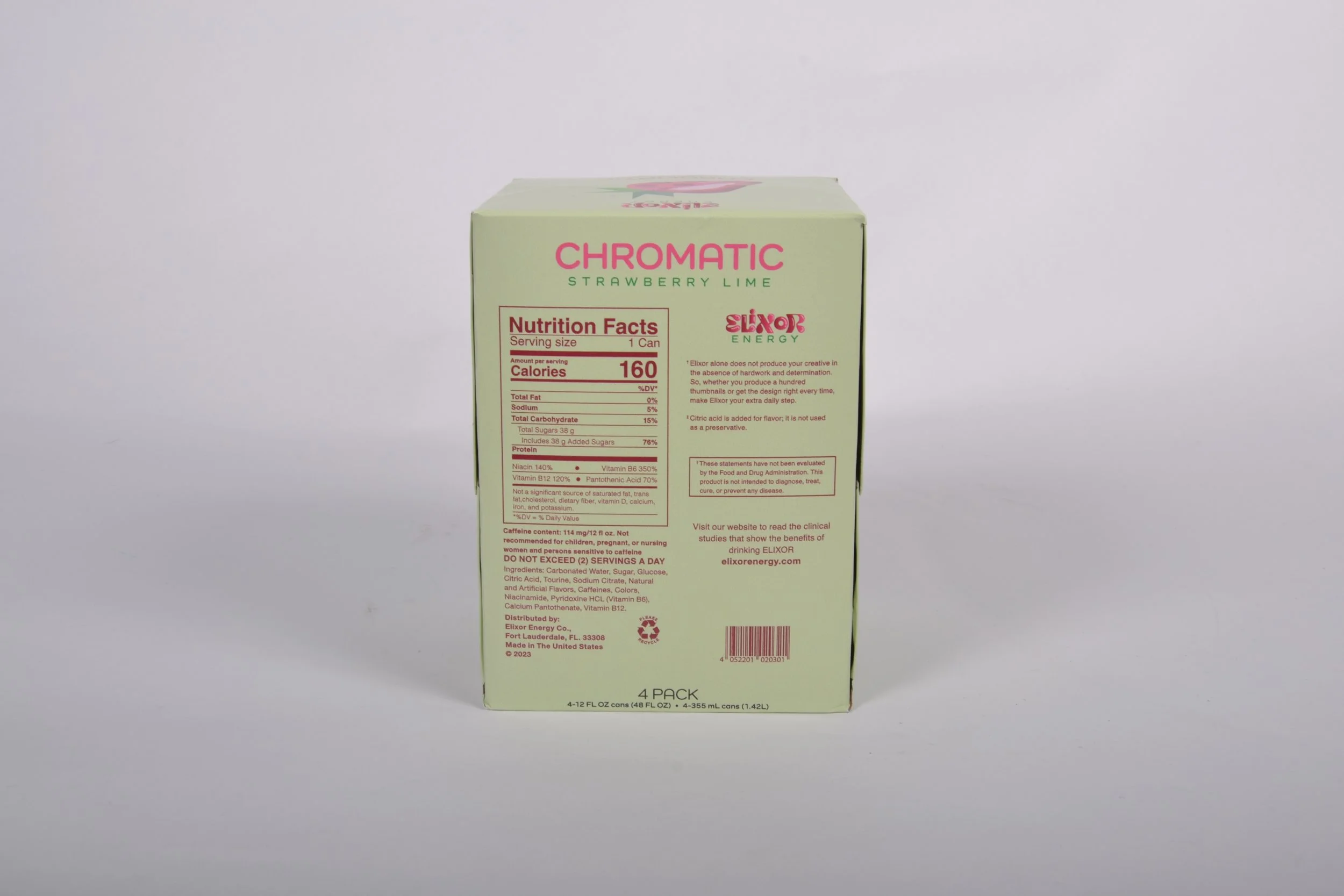
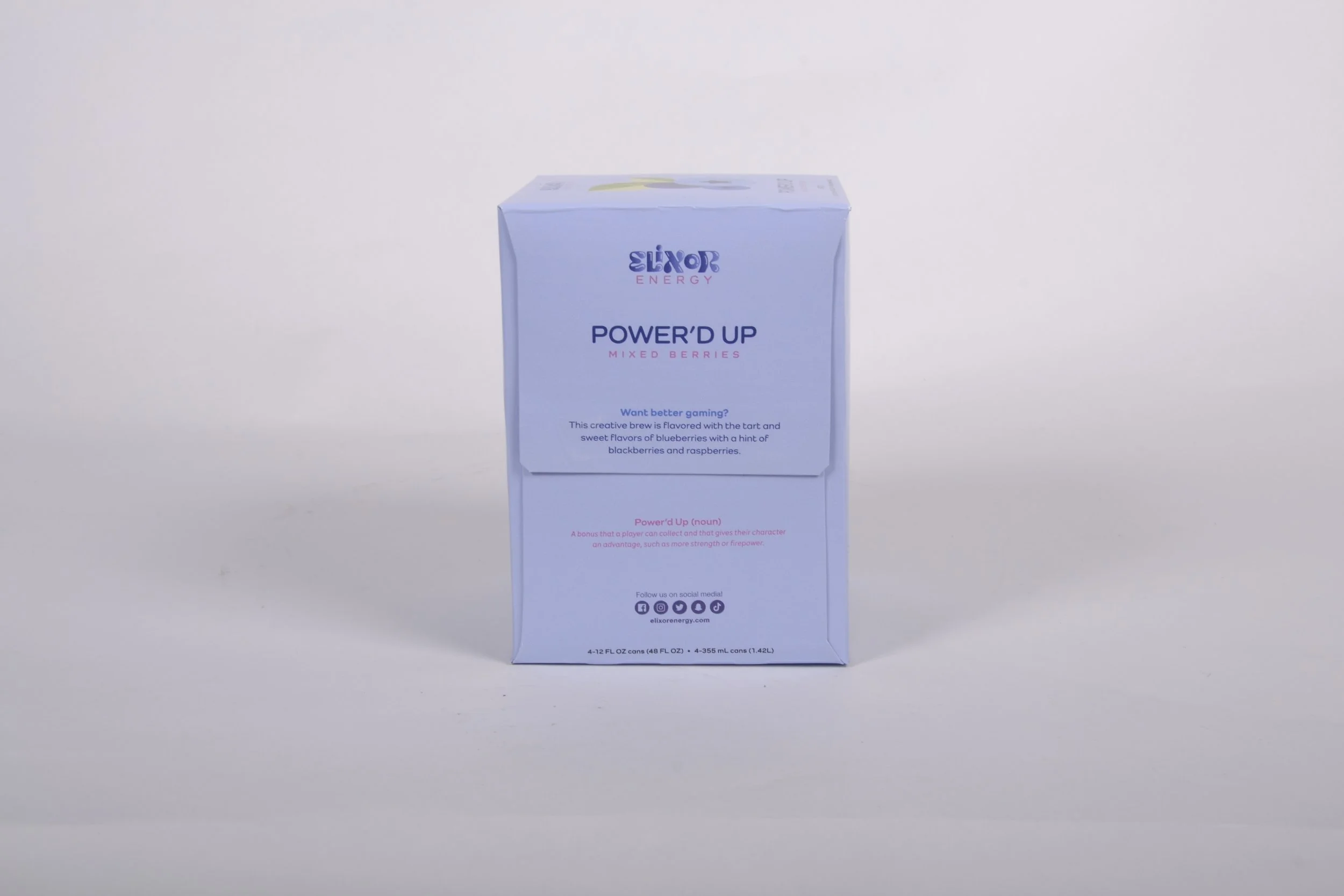
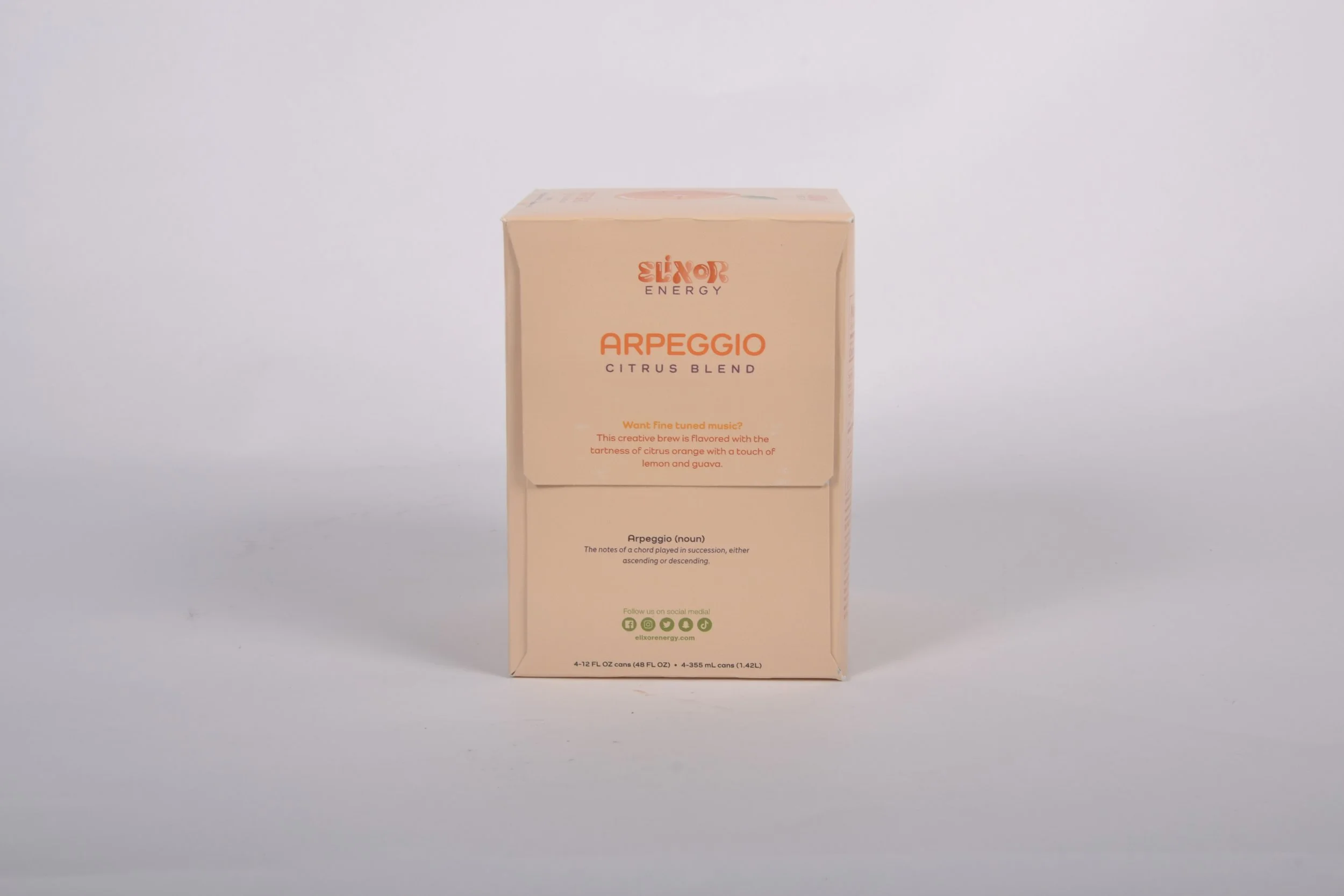
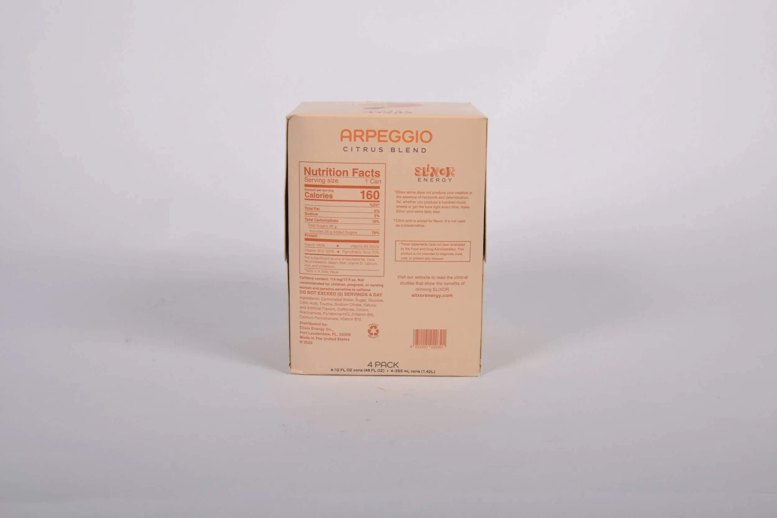
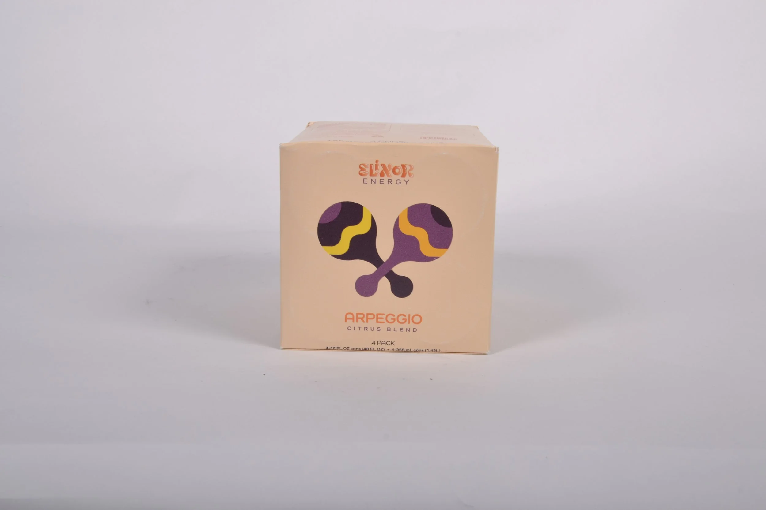
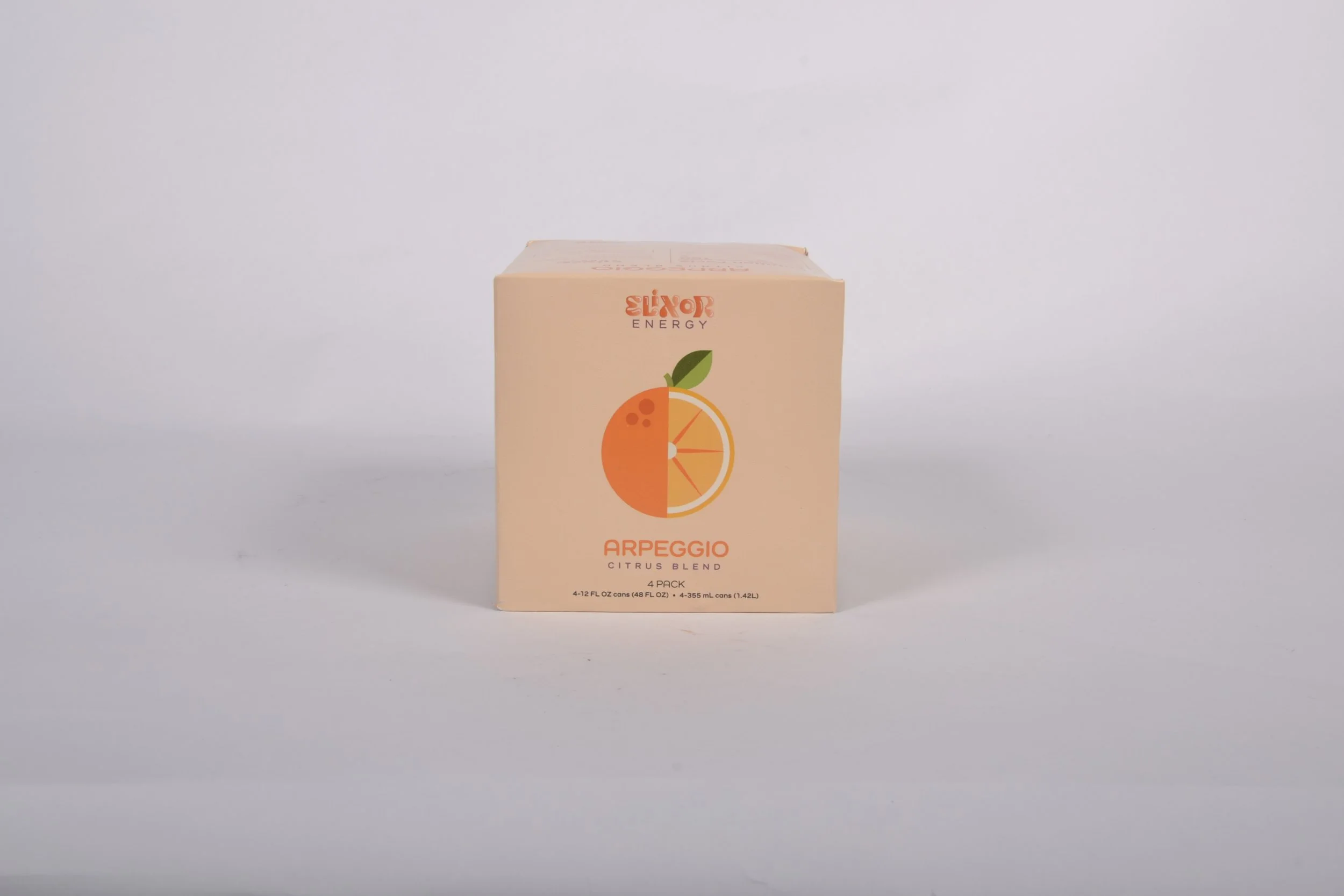
Like the cans, the designs were transferred to the four packs as their PDP as well. On the top and bottom of the packaging, it includes an element and fruit on either side from each flavor profile, allowing for the brand to still be distinguishable from those two orientations. The twist of the four packs come from the boxes NOT being the same color as the cans. I decided on this design choice because I thought it would be a fun twist for the boxes to rather be the corresponding color to the cans as a surprise when the cans are removed.
In-Store Display
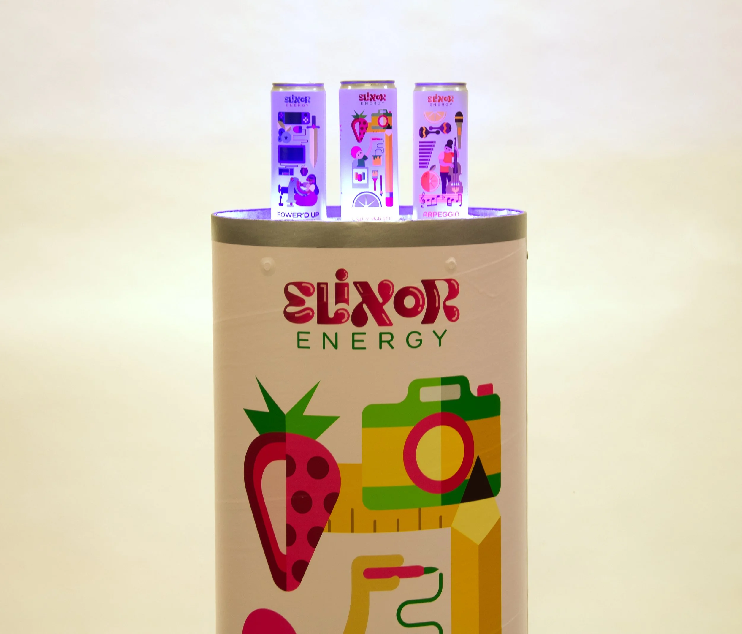
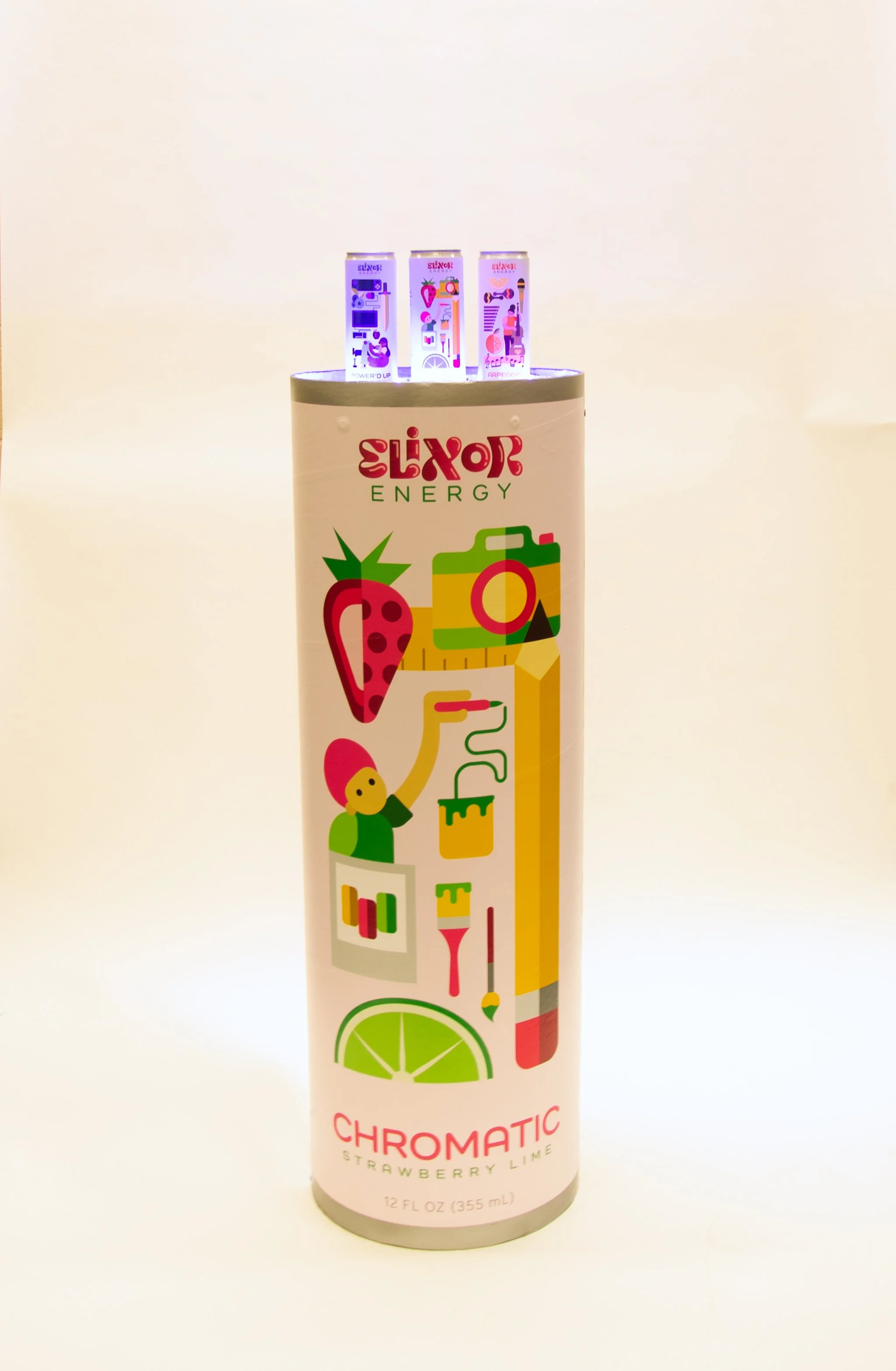
My in-store display is an enlarged version of my Chromatic Strawberry Lime flavored can. Instead of going in the generic store display direction, I felt that this approach would line up better with the fun and twisted aesthetic that my brand already entails. The platform of the can is slightly lowered inside of the can so that the displayed cans look as if they are floating. To make it extra fun, I also included strip lights around the top of the can to allow the cans to be illuminated.
Instagram Marketing Campaign
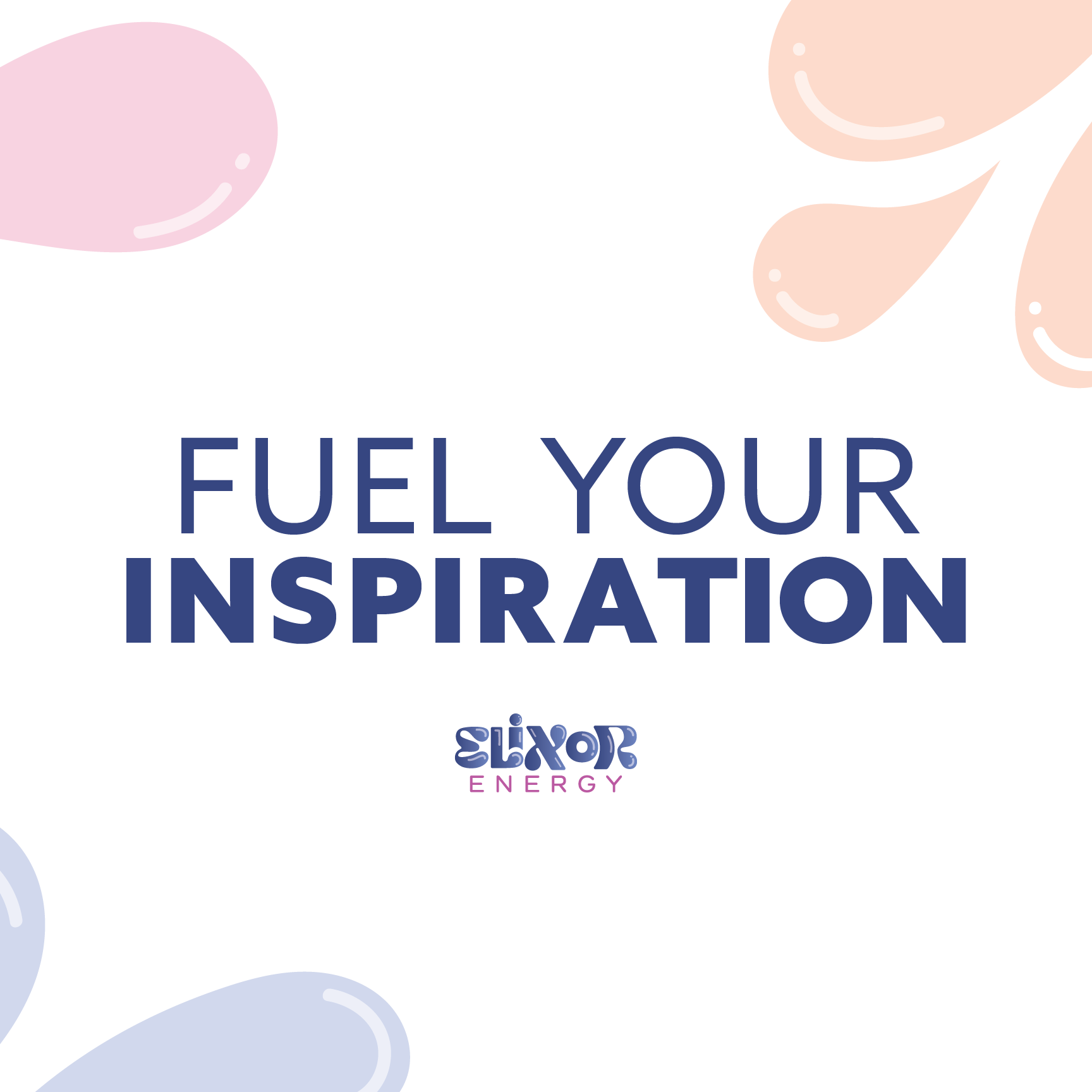
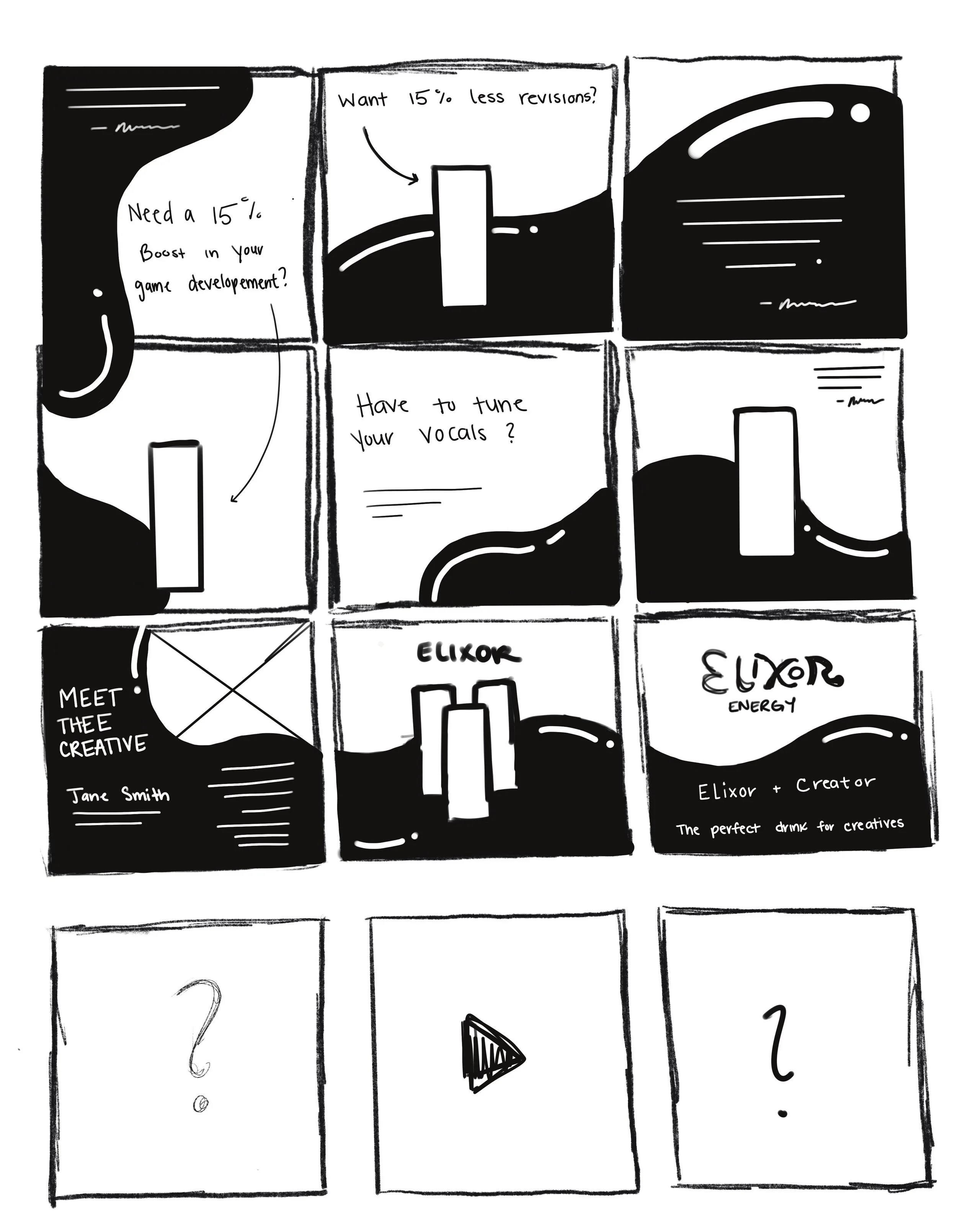
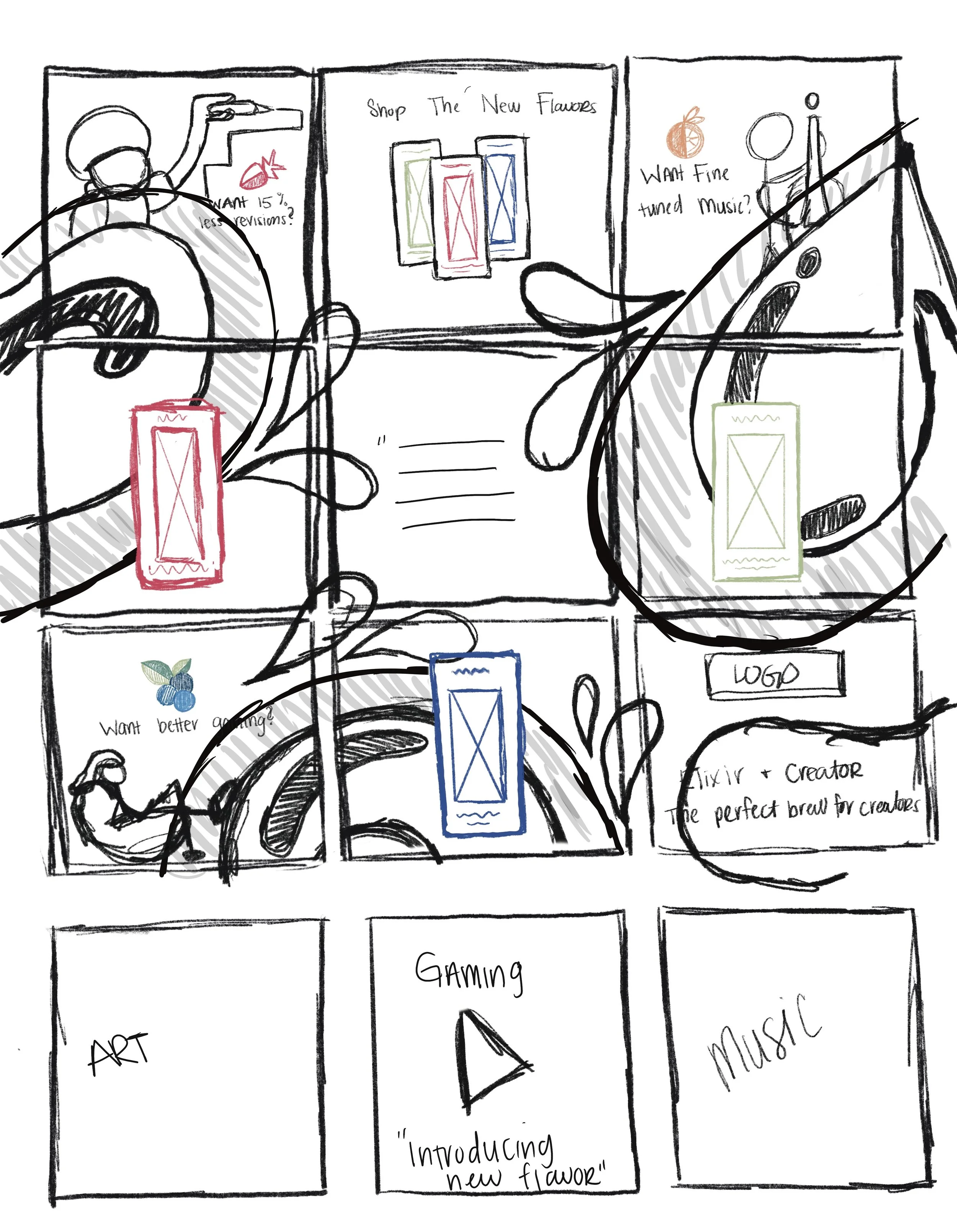
For my 9-tile puzzle feed, I incorporated the human figures used throughout my design so our customers can envision themselves in the space doing that act and mixed it with the rounded, bubbly aesthetics from my logo as well. For my 2 advertisements, I replaced the illustrated figures with photography of creators doing their passion while drinking Elixor that has illustrated liquid instead of physical liquid to tie back once again to the logo. The switch to photography for the two advertisements allows for a sense of realism for our customers, especially if we’re aiming to reel them in and purchase our products to help them in the same way as the photo. My advertisement reel is also a sense of realism, showing off a new flavor – Power’d Up Mixed Berries. It’s assumed that as the brand continues to market, each flavor will get their own video and Power’d Up Mixed Berries would soon have a photographic advertisement as well.
Below is a link to the instagram page as well as an embedded format of the campaign.


